
Case Study
The Hechinger Report
A Bright Identity for Education News
How we helped the country’s premiere education magazine explain who they are — with a little inspiration from an unlikely subject
Five years ago, The Hechinger Institute found itself at a pivotal juncture. Originally committed to training professional journalists, newsroom cutbacks forced the Institute to re-imagine itself. And, in the face of steep challenges, it did just that, morphing into a news organization (The Hechinger Report) dedicated to reporting on inequality and innovation in the American education system.
When we arrived, Hechinger was thriving. It had established itself as the premier news magazine covering education, a peer to The Chronicle of Higher Education. Just one problem: They didn’t look like it. Although their stories routinely ran in The New York Times, The Atlantic, and NPR (to name a few), their own website looked like a blog. That’s where we came in.
Upstatement set out to create a new identity and website that matched the quality of Hechinger’s journalism. We helped their small staff relaunch the website as a destination that would show (or, as their director puts it, exclaim) their mission. We can proudly say it’s been quite a success.
In This Case Study

Part
1
Site Design
Making a brand statement on the homepage
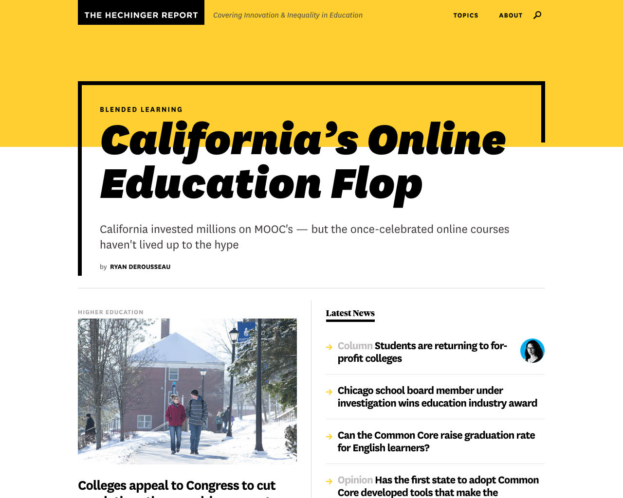
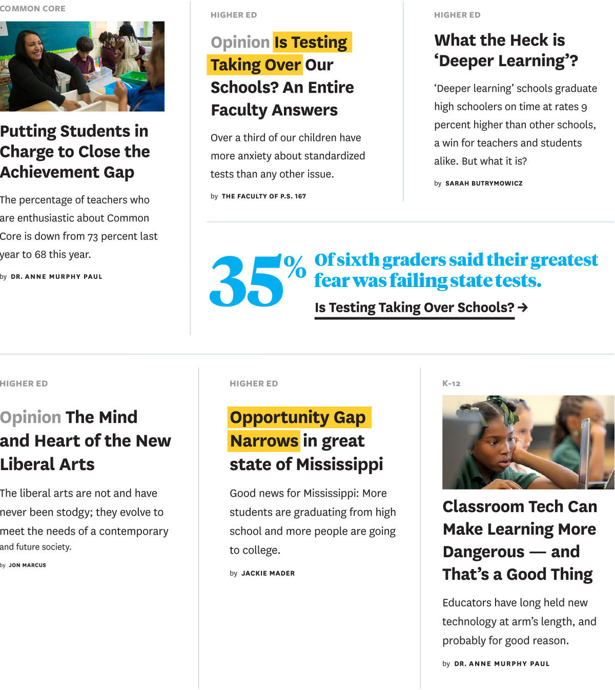
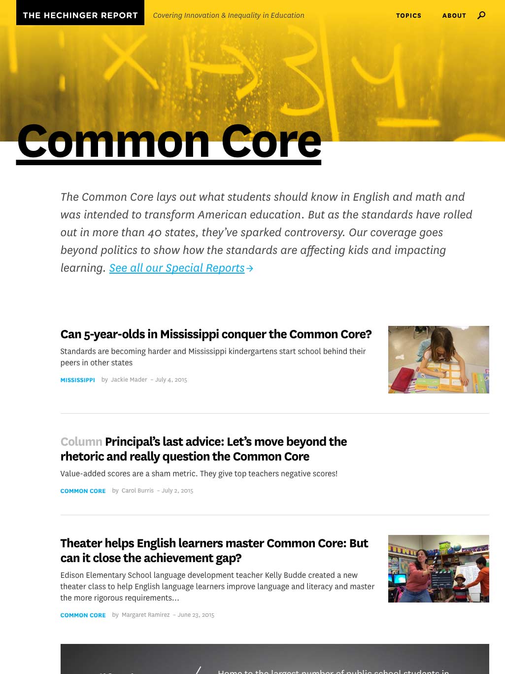
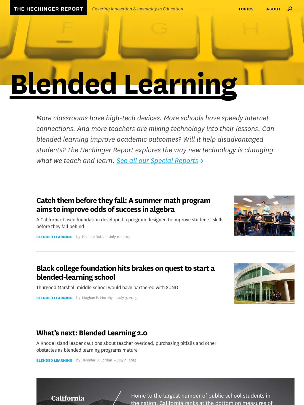
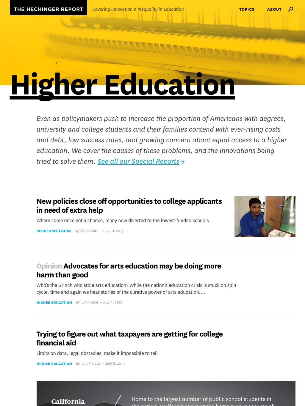
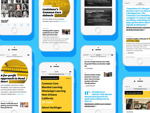
While Hechinger had established itself with influential, award-winning stories, it lacked name recognition. There’s a saying in journalism, “Show don’t tell.” With Hechinger trying to cement itself as primary destination for education news, we wanted readers to quickly sense who Hechinger is and what they care about.
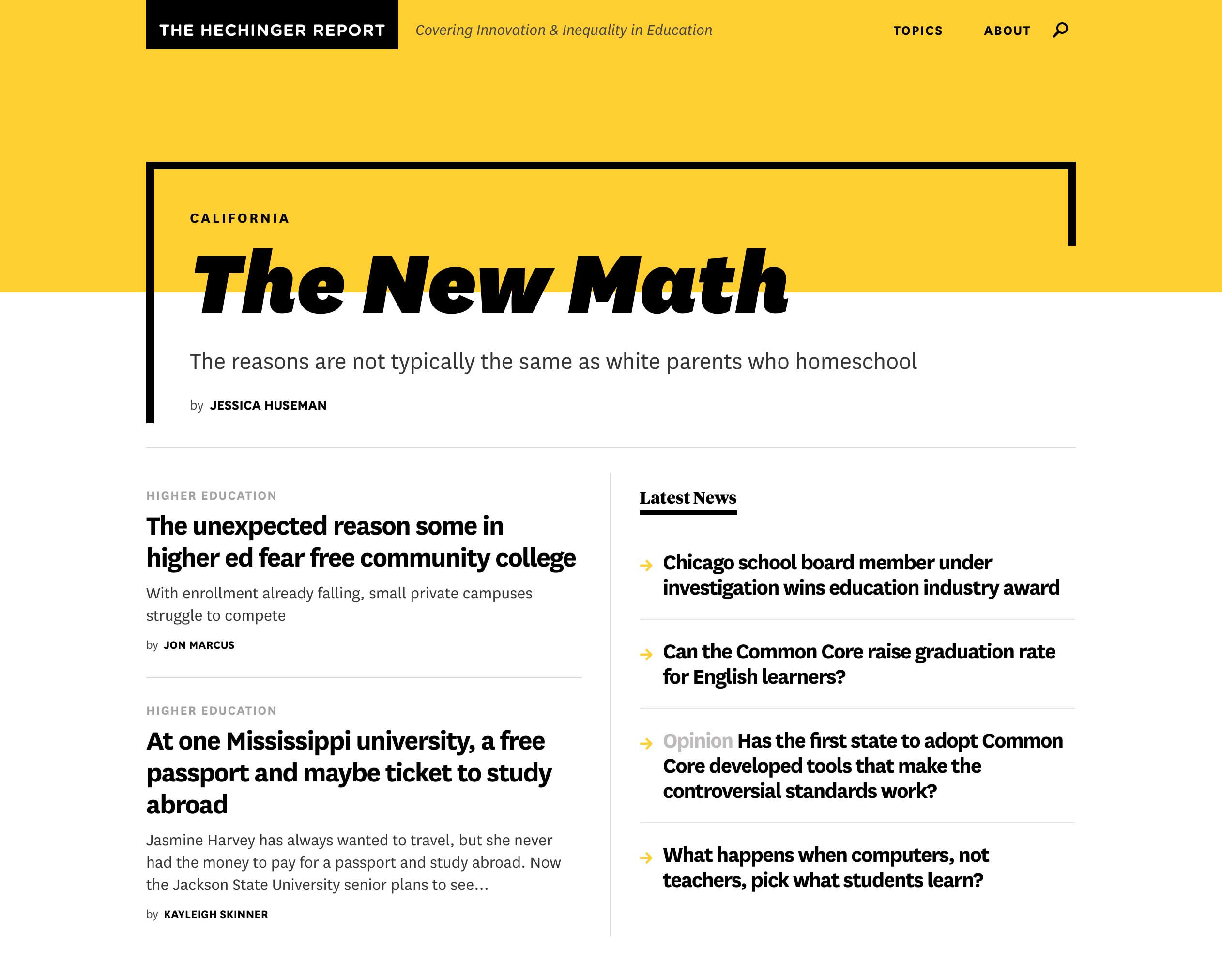
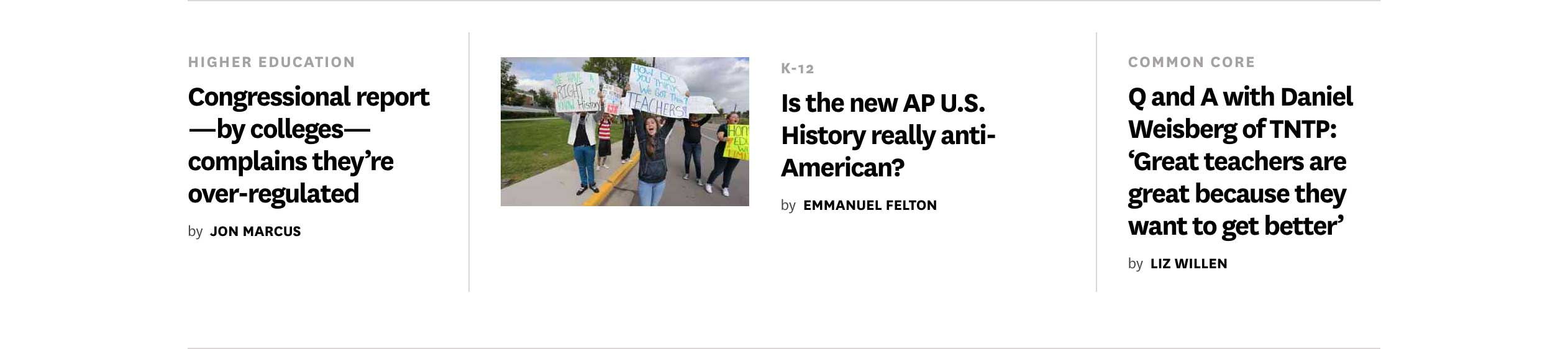
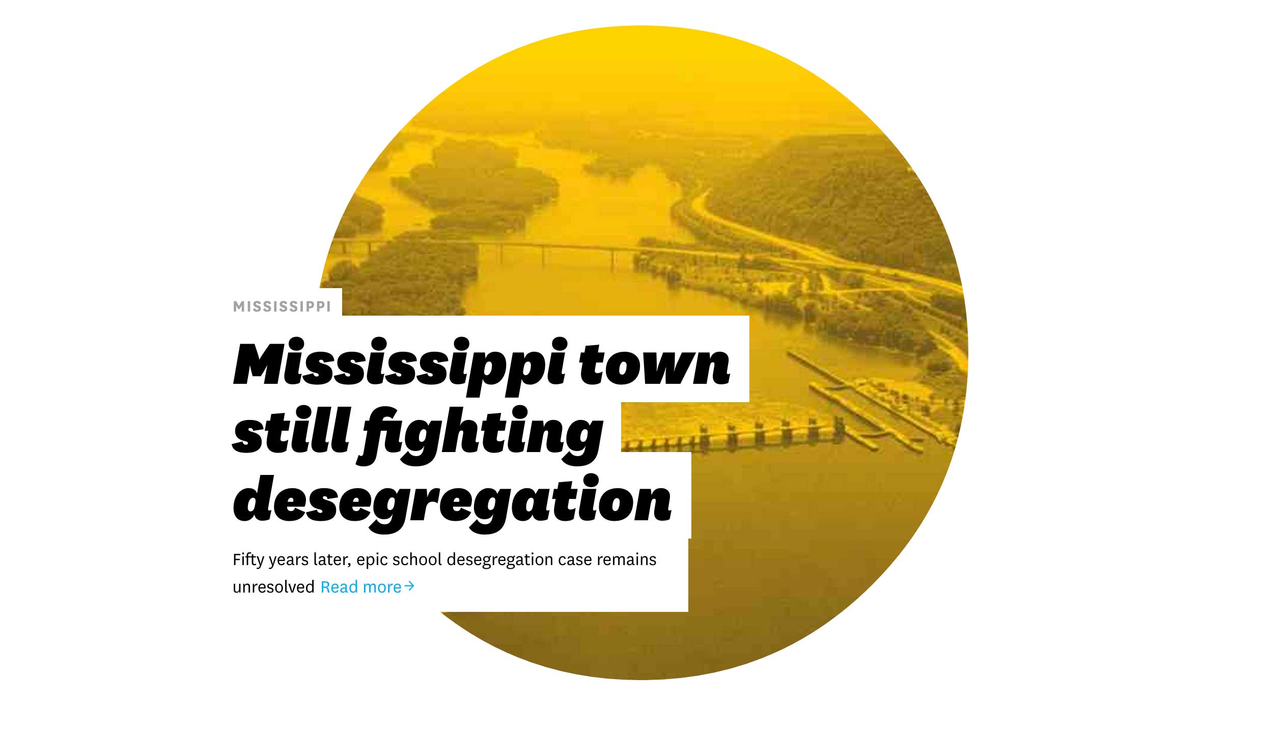
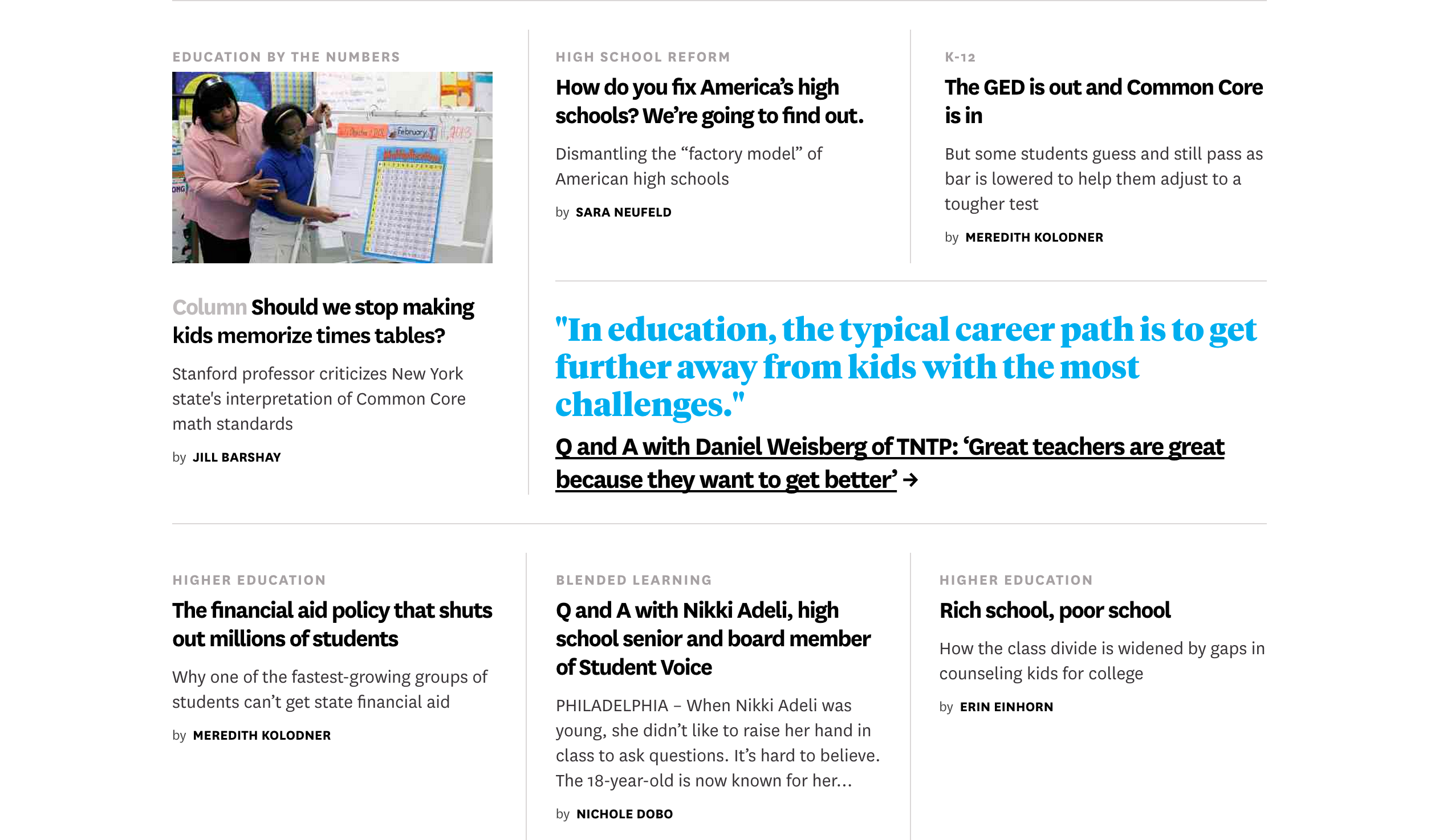
For starters, Hechinger is a magazine. They publish a select number of thoughtful pieces about the most important issues (Common Core, computers in the classroom), and places (New Orleans, Mississippi) in American education. Every few days, they produce a long, strong, original cover story.
To make things more challenging, Hechinger can’t count on strong photos to carry their vivid, human-centered stories. But what they lack in photography, they make up for in reporting prowess. Their stories are deeply researched, chock full of shocking, context-setting numbers that grab you by the shirt and make you want to read. We wanted the homepage to have the same effect.
The average caseload of a public high school counselor — nearly double the recommended limit
Rich School, Poor School

Photography
Balancing Style with Substance
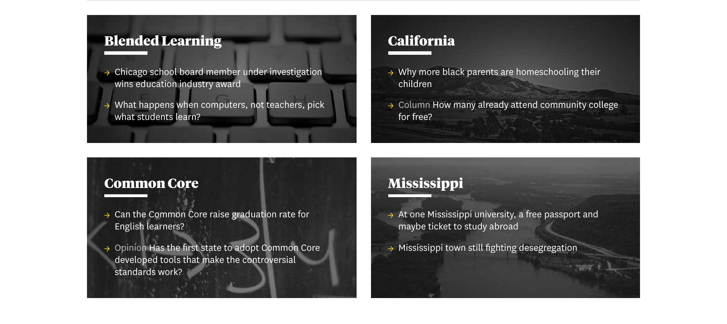
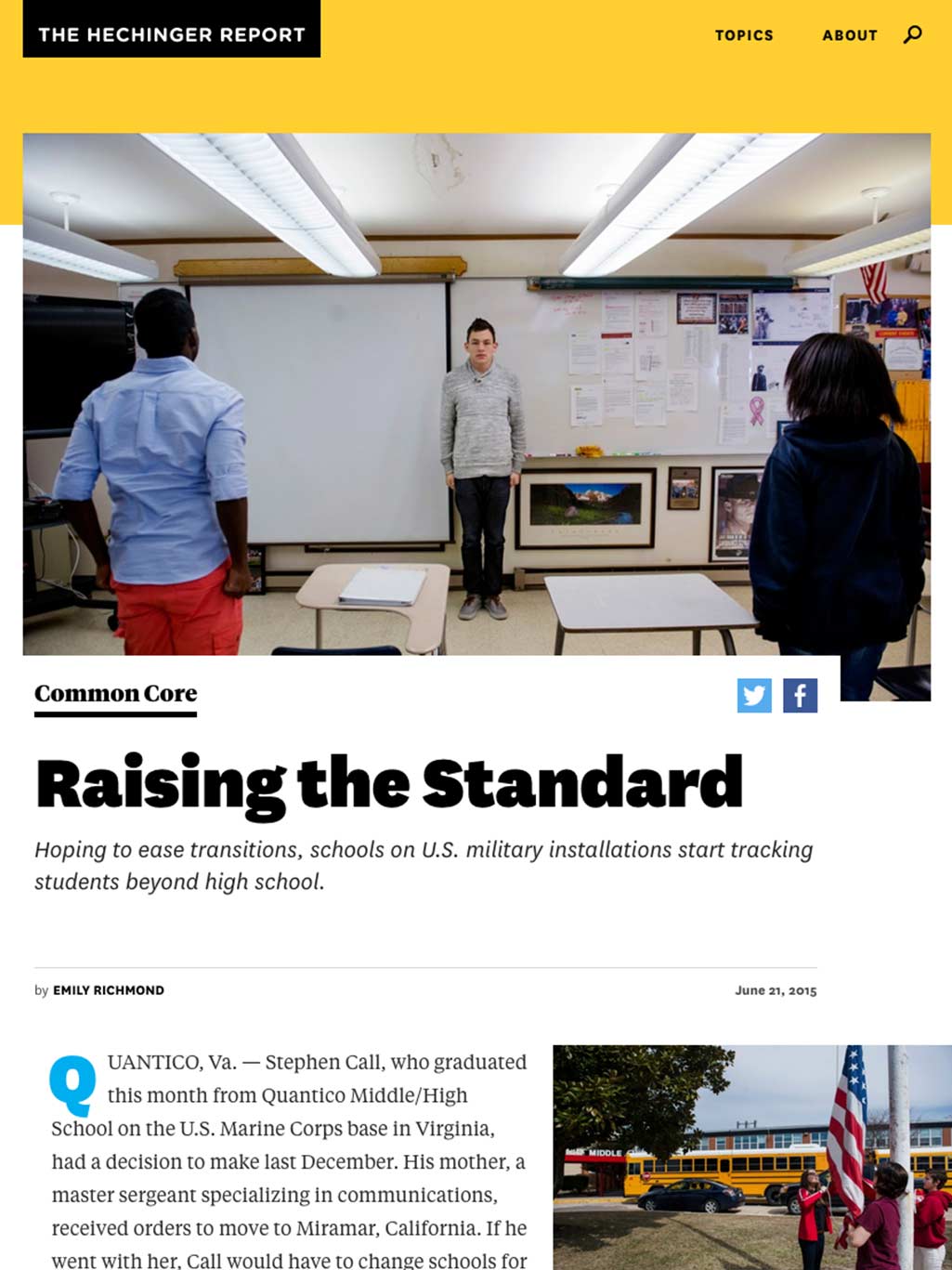
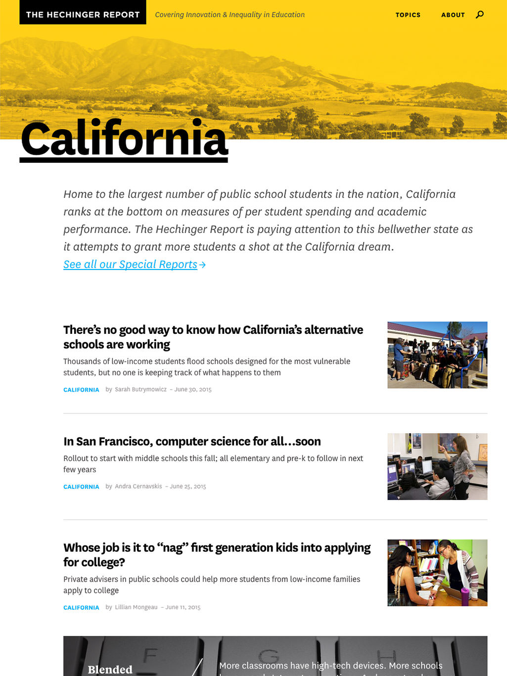
While Hechinger can’t always rely on great photos, images are important to the editors and the audience. Throughout the process, we repeated the phrase, “Policy is boring. Kids are interesting.” That’s why the site is peppered with photos that take us inside the classroom.
Many of those photos are iPhone shots snapped by the story’s author. Our tasteful presentation makes each image look good no matter what. And when Hechinger has great photography (they hire freelancers for their biggest features), they still have the option to go big.
“There is something fearless about the personality of this site. The impactful use of type and the striking yellow create an experience that is branded and distinct without sacrificing on readability and scannability of the articles.”
From ‘The Intersect’
March 20, 2015
Part
2
Branding
Inspiration from an unlikely subject

The Dreaded Blue Book
Our palms still get a little sweaty at the thought of the classic pale blue exam booklet. Pencils ready, class! But once the flashbacks stopped, we found something inspiring in the dreaded blue book.
The same book you see above found its way onto our inspiration board and played a big role in the final design. We loved how evocative the exam booklet felt even without photos. The bold rules, big type, and simple construction informed everything from the final logo to the top story treatment.
Typography
Friendly & Approachable
While the blue book inspired us, we didn’t want Hechinger to feel like taking an exam. The design called for a friendly sans serif. Approachable, but still serious enough for the subject matter. National struck precisely the right balance.
For contrast, we searched for a chunky, bold serif. Enter Tiempos. Klim Type Foundry’s flagship typeface provided the perfect foil, particularly because both typefaces were penned by the same person, the magnificent Kris Sowersby.

Brand Guide
Completing the System
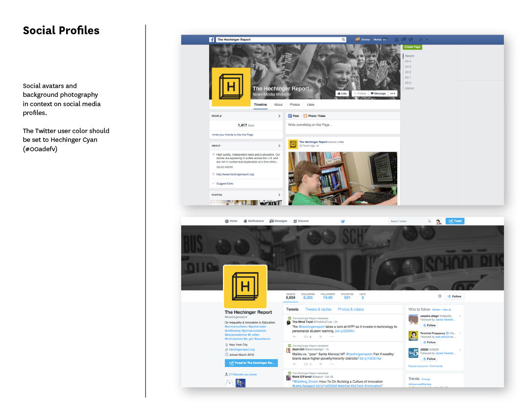
After developing the branding and site design, we extended the system to cover business cards, buttons, stationary, and social media (an often undervalued expression of the identity). Our extensive brand guideline book also includes alternate logo uses, a type/color guide, and instructions for how and when to use photography.

Part
3
Smart
Stream
Making complex pages easy to manage
At Upstatement, we believe that a great reading experience starts with a great editing experience. That’s why we recently hosted a content management hackathon with teams from ESPN, The Verge, and National Geographic. And when Hechinger’s editors needed a simple solution to manage their complex homepage, we designed and built Stream Manager, a slick editor that seamlessly integrates with the WordPress backend.
With Stream Manager, content management problems that used to cause headaches are accomplished in a snap. Want change a story position? It’s as easy as dragging and dropping. Add a new story? No problem, the freshest stories automatically appear in your stream — and await approval before showing up on the homepage. What about pinning stories? We’ve got that covered, too. Pin a story anywhere, from the very first to the very last slot on the page.
Drag & Drop Organization
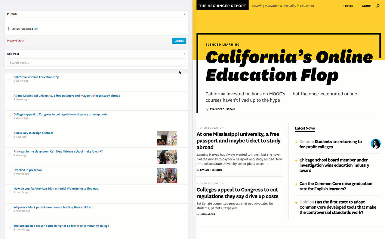
Pin Important Articles
Easily Search for a Post
Part
4
Results
Increased traffic and a happy client
We couldn’t have asked for a more passionate, dedicated team than Sarah, Davin, Matt and the gang at Hechinger Report. We’re immensely proud of the work we did together. The project started with clear goals, and we accomplished each one.
Design a new identity that reflects Hechinger's distinct voice
Show people who you are and what you do
Help Hechinger to become a destination site
The third goal included some key performance metrics. We wanted the new design to encourage recirculation (the number of pages somebody visits after their initial page view) and to see an overall increase in traffic. In the end, we saw both go up — and by a substantial margin.
13%
Increase in page views
2x
Increase in Recirculation
“Upstatement was attentive to our goals and did a great job of figuring out how to define what we do visually. We love love love the design.”

Sarah Garland
Editor, The Hechinger Report
What We Did
- Research
- Content Strategy
- Design
- Front-End Dev
- CMS Development
- Launch