


Case Study
MIT Technology Review
A Classic Comes Back to the Future
How we took Technology Review back to its roots while building a strategy for the future
If you don’t already know MIT Technology Review, you should. For 116 years, they’ve written about tomorrow’s technology in a way that the world can understand. Think of it as the love child of Wired & Scientific American (though smarter than the former and more accessible than the latter).
All along, they’ve been known for groundbreaking reporting and design. Our hero, the great Muriel Cooper, led the design staff in the 1960s when the magazine established its iconic Bauhaus-inspired identity. Today, it provides an authoritative filter for the overwhelming flood of information about technology and its effect on our lives.
Technology Review called Upstatement at an important moment. The magazine had never been better, yet digital was underperforming. They needed to rethink the content strategy, redesign the site, and work out a new model for monetization. Working closely with the amazing Technology Review team, we designed a solution that would have made Muriel proud.
In This Case Study
Part
1
Design
A digital system to honor a rich print legacy
“Too often, the role of the designer is to clothe a set of messages they’ve had no participation in. Here is a book. You didn’t write it. You don’t change it except insofar as you present the information somebody else has generated. You’re not really collaborating, either, because the stuff is here, and accomplished fact. I decided I had to wash that out of my head and impose my own problems.”
Muriel CooperWe’ve been fans of MIT Tech Review for a long time. Several people at Upstatement are lifelong subscribers. Going into the project, we were very familiar with Tech Review’s rich design history. Modernism. Swiss type. Strong grids. We wanted to honor all of that.
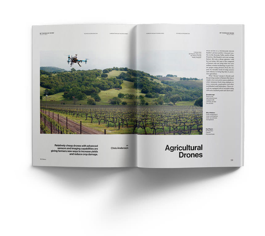
Technology Review’s design tradition continues today. The print magazine features smart artwork, vibrant photos, and a familiar taste for minimalism. The illustrations in particular are among the best in modern print. The design team knows how to get the best out of every artist and we wanted unleash their creativity on the website.
History
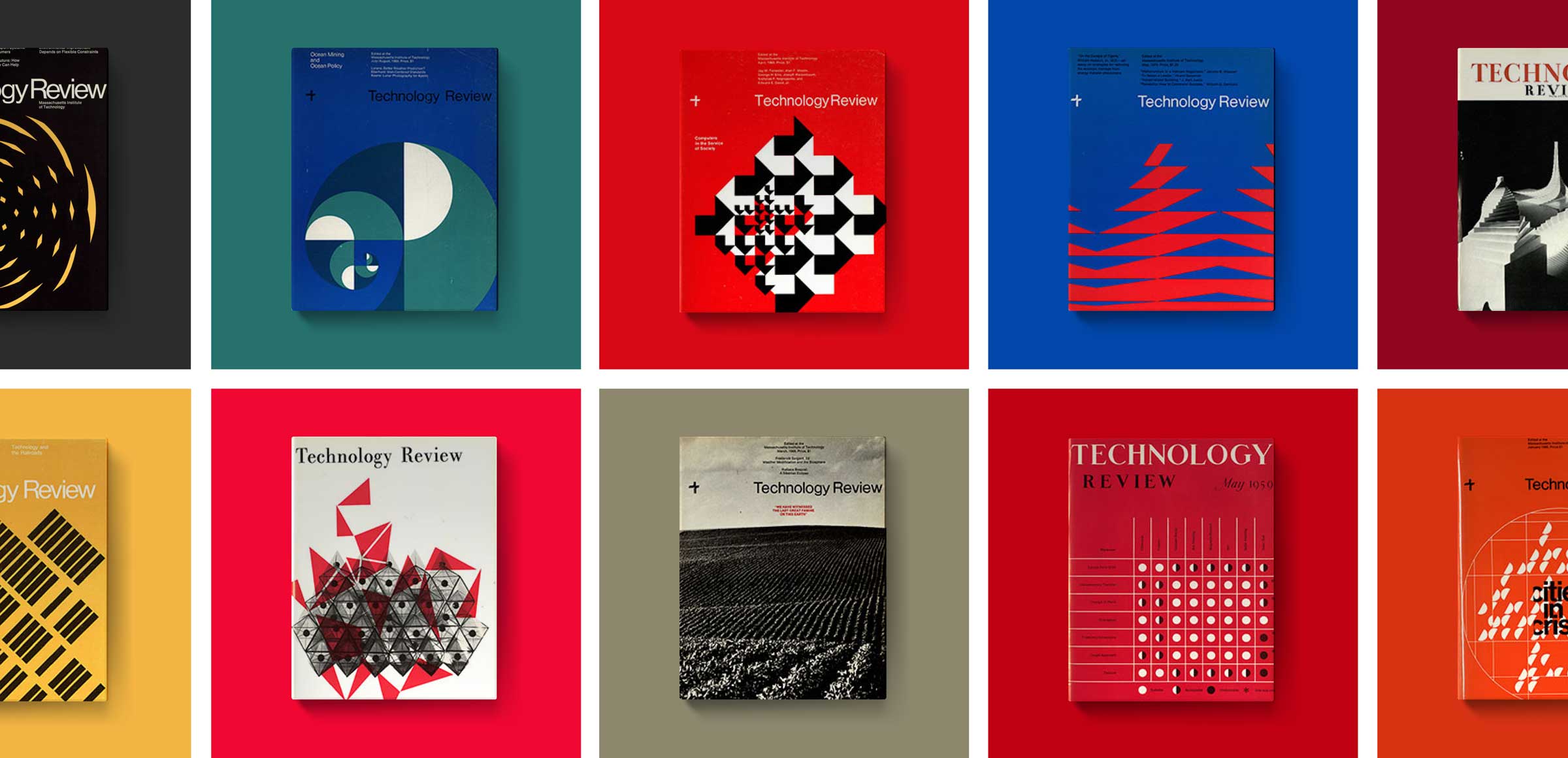
Paying Homage to Cooper, Casey & Coburn
Muriel Cooper, Ralph Coburn, and Jacqueline Casey defined the look of MIT in the 50’s and 60’s, headlined by iconic covers featuring abstract illustrations and inventive typography. They totally hold up today. At the top of this case study, you can see our animated takes on these classic covers.
But the history goes beyond what you can see. Cooper defined not only an iconic style, but a new role for designers. Her words are a guiding light for Upstatement. The quote that leads this section perfectly describes our values. We’re not here to simply pretty up a pre-conceived message. Our job is to make the world easier to understand. To accomplish that, we have to break things apart, figure out how they work, and put them back together. It’s the reason you’ll often hear people around the office saying, “Interrogate the premise.”


Site Design
A Contemporary Take on Modernism
We were determined to create a design that honored the Tech Review’s past and made the most of their present strengths. The result is a type-driven design system with endless opportunities for art and photography to enhance the story. The current design team has really embraced the new canvas. We’re constantly wowed by their art direction. It’s worth visiting everyday just to see what they’ve commissioned.


Part
2
Strategy
Defining the problem, finding our vision
When we first met with Erik Pelletier, he was blunt. Recently hired as VP of Product Development, he told us that Technology Review needed a new digital strategy. He and his team had already laid the groundwork for change. They conducted an extensive reader survey that highlighted the organization’s strengths and weaknesses. All the key players were primed and ready for something new — but what?
We worked closely with Erik and his team to create a cohesive digital content and product strategy that would answer the question for a multitude of stakeholders: Editors, writers, advertisers, sales, and — most important — readers. With help from analytics and user interviews, we honed in on the typical TR subscriber. They’re innovators and early adopters. Intelligent, highly educated business & technology leaders, most in a senior or executive role.
Our creative brief, which triangulates Technology Review’s mission, audience, and digital goals, expanded on that insight.
From the Creative Brief
Your typical reader tucks a supercomputer’s worth of processing power into their suit pocket everyday. With the ocean of information available in a single swipe, people need a guide who puts it all in context, points toward the future, and helps them make smarter choices in a digital world.
In a recent audience survey, your readers praised you for doing just that. You’re the approachable expert who speaks with authority and clarity about the most important technical topics of the day. You’re not wonky like an academic journal or full of empty calories like a popular newsstand magazine. There is nobody better to provide an intelligent, lucid filter on the world of technology, everyday.
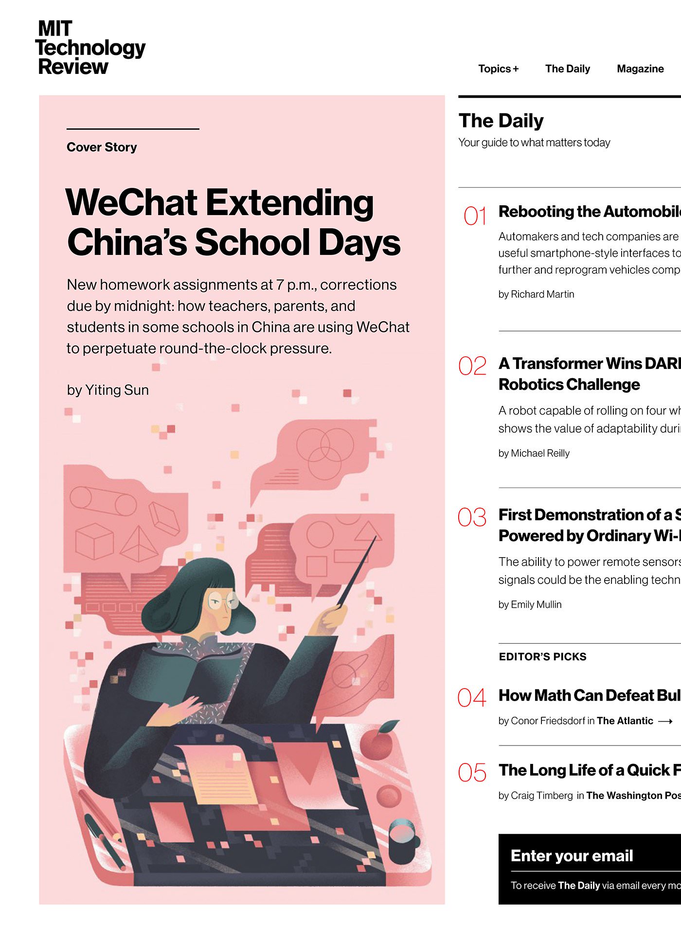
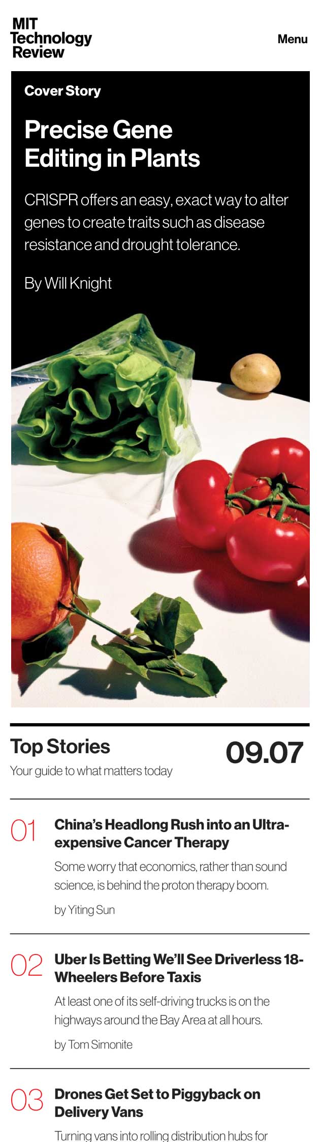
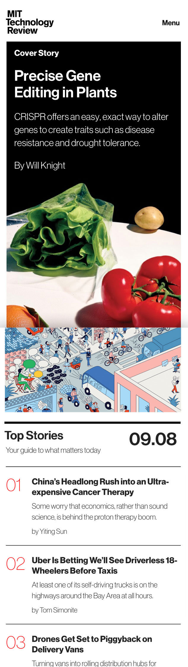
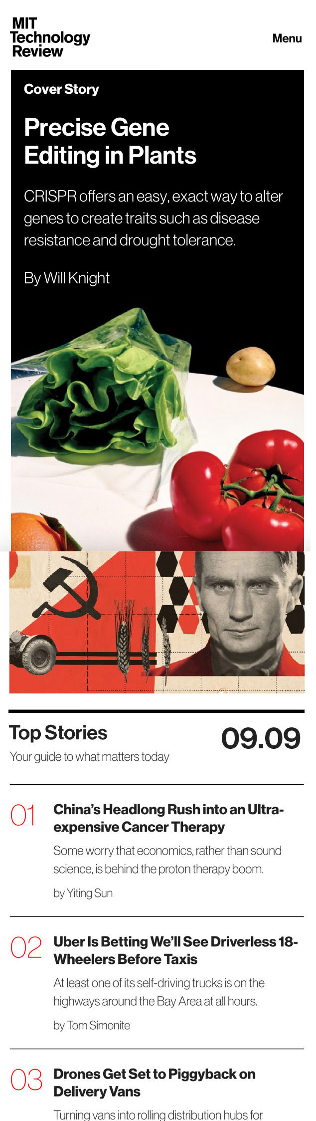
Our redesign tightened that filter and embraced the goal of making Technology Review a daily destination. While innovation moves at a breakneck pace, the new website distills the day’s news into an easy-to-digest format. You can see the strategy in action on “The Daily,” a new editorial product we helped create (more on that later), and on the redesigned homepage, which you can see below.
The page starts with an in-depth feature that rotates daily and a digest that curates the five stories that matter today.
New advertising opportunities are big, bold, and high value. You can’t miss them, yet they seamlessly fit the browsing experience.

Curated shelves of stories are designed to pique curiosity — and make sure last week’s big stories don’t disappear from the homepage.
Flexible internal promos allow Technology Review to promote an array of editorial and business interests, including subscriber-only print publications, paid events, top 10 lists, evergreen content, and more.
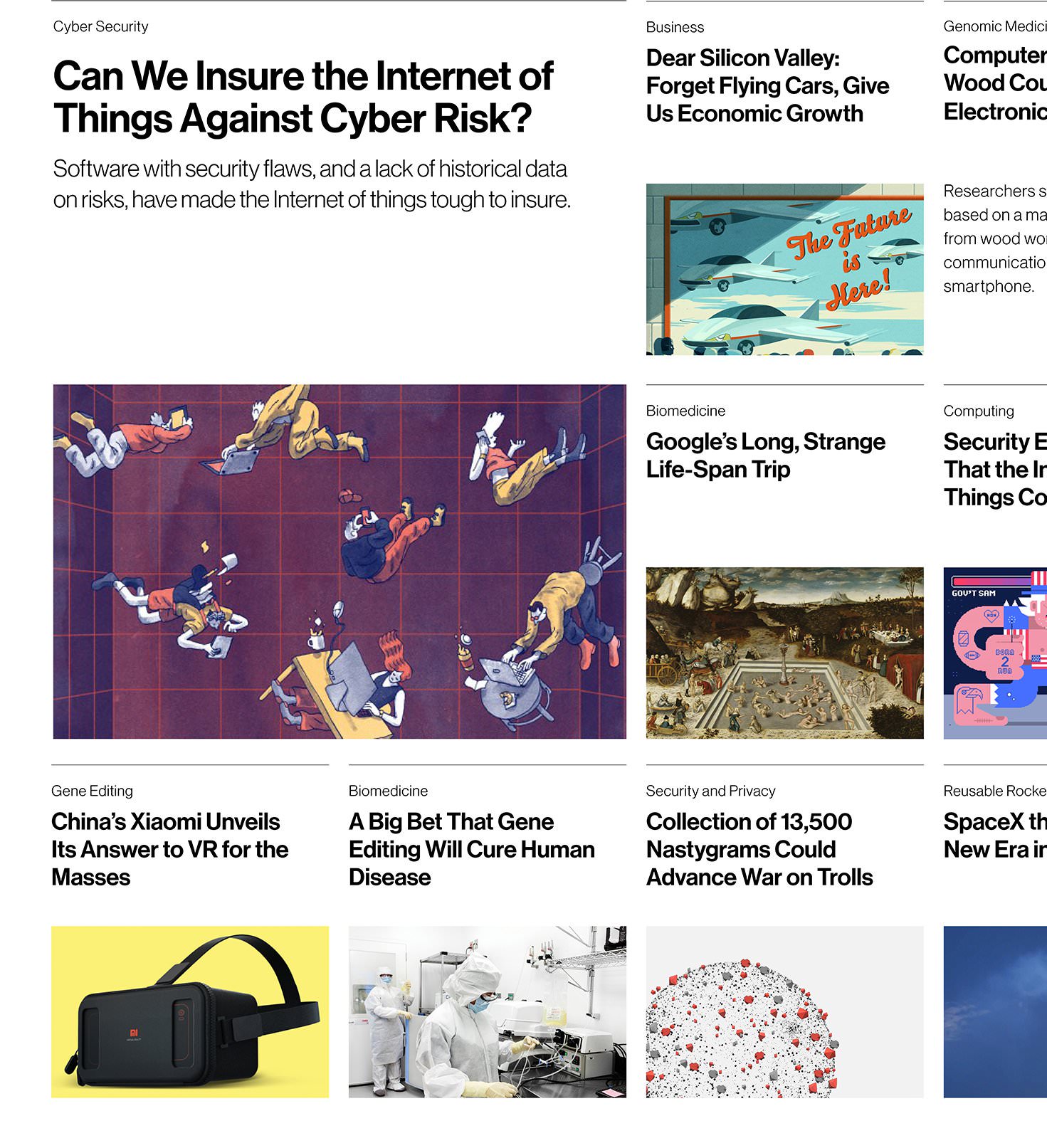
Feature blocks repurpose previous cover stories, giving them a longer shelf life and making big stories easier to discover.
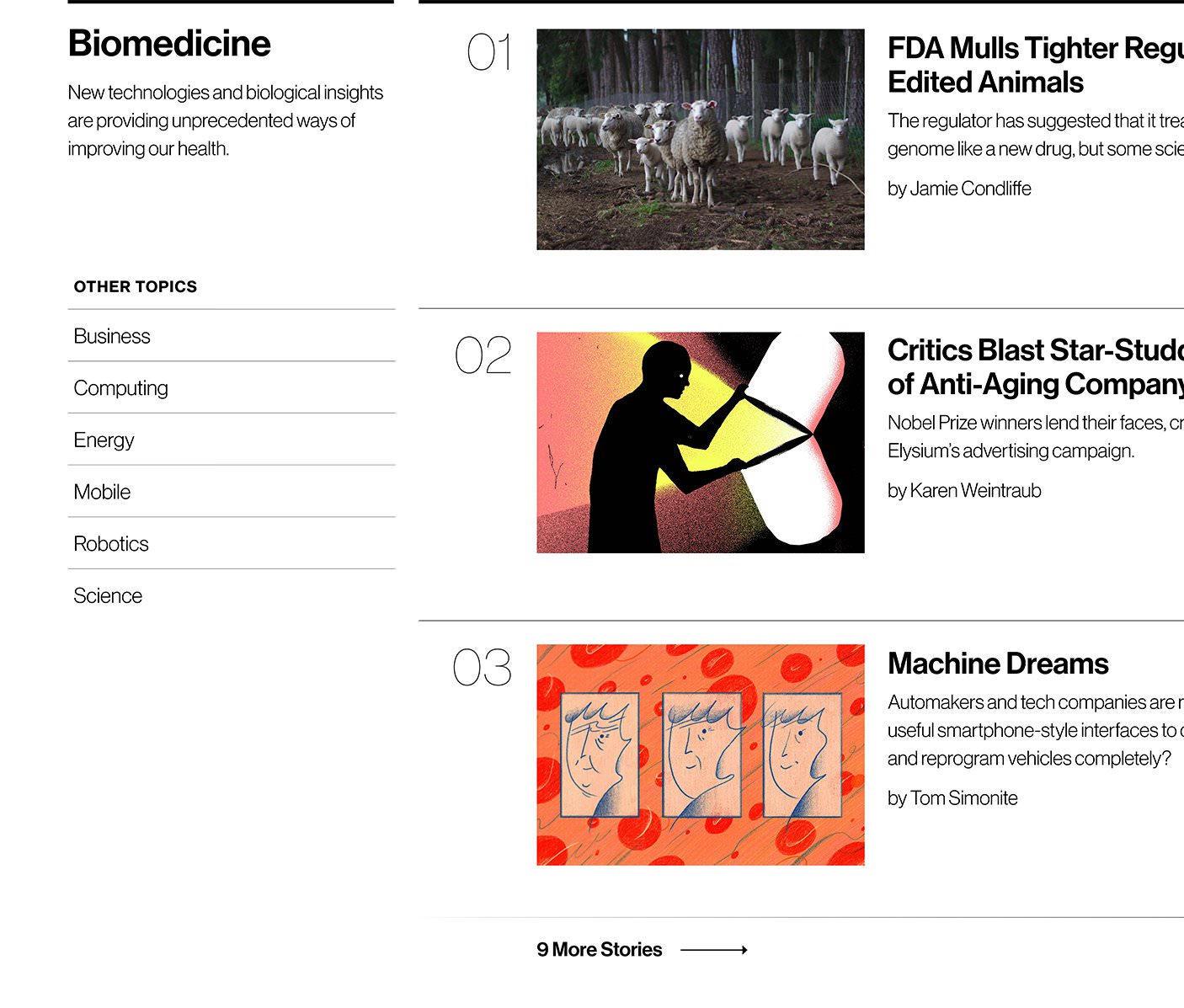
Topic blocks feature the long-term subjects that editors think are most important to TR readers, including Biomedicine, Energy, Robotics, etc.
Content Strategy
Making Technology Review a Daily Destination
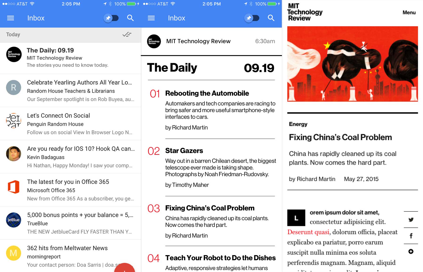
When we arrived, Technology Review showed big, predictable spikes in traffic every two months when the magazine published. Readers flocked to the site for new issues, but felt they had no reason to visit in between. After analyzing site analytics, auditing existing newsletters, and poring over customer surveys, Upstatement proposed a new product called “The Daily.” It’s a digest designed to reach busy execs who told us they’re overwhelmed with information.
On the Site
& In Your Inbox
“The Daily” features the five technology stories that matter right now and reaches people in multiple contexts (web, social, email). It’s the only thing a tech exec needs to read before starting their day. While featured prominently on the homepage, we knew it would be hard for readers to make a habit of visiting the website everyday. So we prioritized getting email signups and meeting people somewhere they go every five minutes — their inbox.
“One of the great aspects of the design is that we have a nice, simple presentation that delivers a story beautifully regardless of the device at hand.”
Erik PelletierVP of Product Development, MIT Technology Review on the RWD Podcast.
Business
Product & Advertising Strategy
During the research phase, we established a few key performance indicators that aligned with overall business goals. Most important, we wanted to increase the number of prospects and boost conversions. Luckily, the TR started from a position of strength.
Over the previous year, Technology Review attracted millions of unique users who visited the site more than once. Converting just a small percentage into paying subscribers would be a big boost to the subscriber base.
The team employed a two-pronged approach to digital revenue: Subscriptions on one side, advertising on the other. In addition to strengthening the subscription model, we also wanted to increase advertising revenue. And nobody wanted to wallpaper the site with ads. To support all those goals, we made a few key decisions.
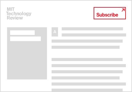
Integrated Calls to Action
Simple, targeted CTAs are sprinkled throughout the site. You can’t miss ’em. The big red subscribe button. The ginormous email signup. It worked, too. Both subscriptions and email signups soared.
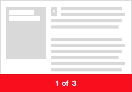
Tiered Article Metering
We paired a new metered model with a semi-infinite story scroll. Anyone can browse a few stories; registered users are rewarded with a higher limit. This led to more qualified leads and more conversions — subscriptions increased 18% in the first six months.
Better Advertising Opportunities
While the design features flexible ad positions that accommodate an array of advertising options, the big move was toward fewer, better ad units. We optimized for premium adverts and created new opportunities for sponsored content — making each pageview more valuable without selling out.

Articles
Any Content in a Single Template
It’s a familiar story for many publishers. The old Tech Review CMS featured dozens of custom designed templates, but almost zero flexibility. Our article designs flipped the script by embracing a new mantra: Tools over templates.
Each article is built on the same skeleton and backed by a suite of tools that make it easy to create unique stories. We built an extensive library of styles, typographic textures, and editorial widgets that can apply to any story. Custom photo galleries, multiple recirculation options, comment prompts — the list goes on. And then there’s our favorite feature. Article toppers automatically adjust their layout based on the content. Got horizontal or vertical images? A square photo? Some funky aspect ratio? No pictures at all? No problem.
Part
3
Results
Working with a great team to move the needle
Throughout the project, we worked closely with Erik, Vanessa, Emily, and the rest of the incredibly savvy TR team. Without their hard work, none of this would have happened. They shepherded the project long after we left and primed the organization for change long before we arrived. As a result, this was the very first (and likely last) time a design presentation ended with a standing ovation.
While we’ll take the applause, we’re most interested in the results. At the outset, we defined three clear goals that would help guide us.
Design a delightful reading experience that honors the publication’s design history
Provide the team with a flexible design architecture
Make it effortless to discover new content
To see if we succeeded, we measured user engagement — specifically page views per visit and email sign ups — and magazine subscriptions. It’s been about a year since launch, and we are psyched to see substantial growth in all three areas!
18%
increase in subscriptions
34%
increase in page views per visit
3.5x
increase in email signups