Case Study
Taste by Penguin Random House
A Niche for the Cookbook Obsessed
How we helped the world’s largest publisher share their passion for food, cooking, and culture
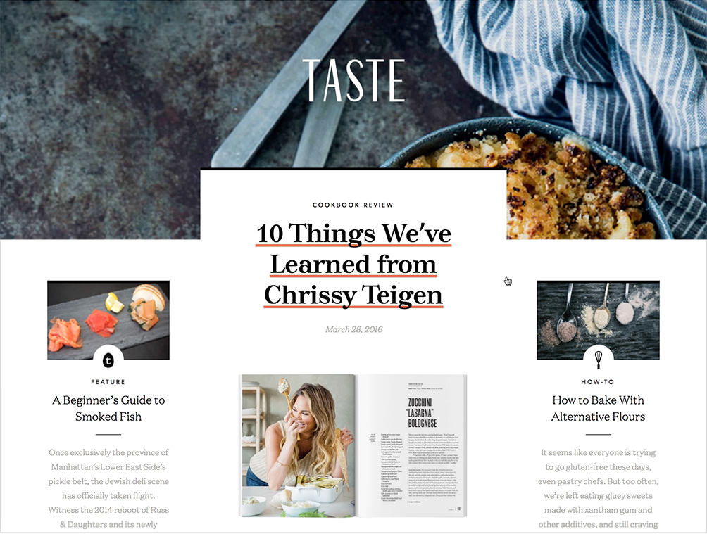
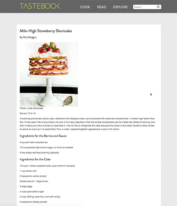
When we first met the Taste team, they were called TasteBook. The TasteBook site started as a cooking app for users to save recipes, upload recipes, and print their own “TasteBooks”. This model started to show its age and outlive its usefulness, but the blog and newsletter that was attached to the site ended up being the only place for Clarkson Potter and 10Speed Press to publish recipes, interviews, features and exclusive content from upcoming cookbooks. TasteBook had something of value, they just needed to reposition it.
TasteBook’s new mission: be a place of cooking discovery, where people who love food, cooking, and culture can find inspiring voices in the kitchen. As the cookbook division of Penguin Random House, they had access to the best talent in the business, decades of experience, and the perspective to teach people about food. With half a million page views per month and 1.4 million recipes in their database, TasteBook had the potential to be a leader in the cookbook community.
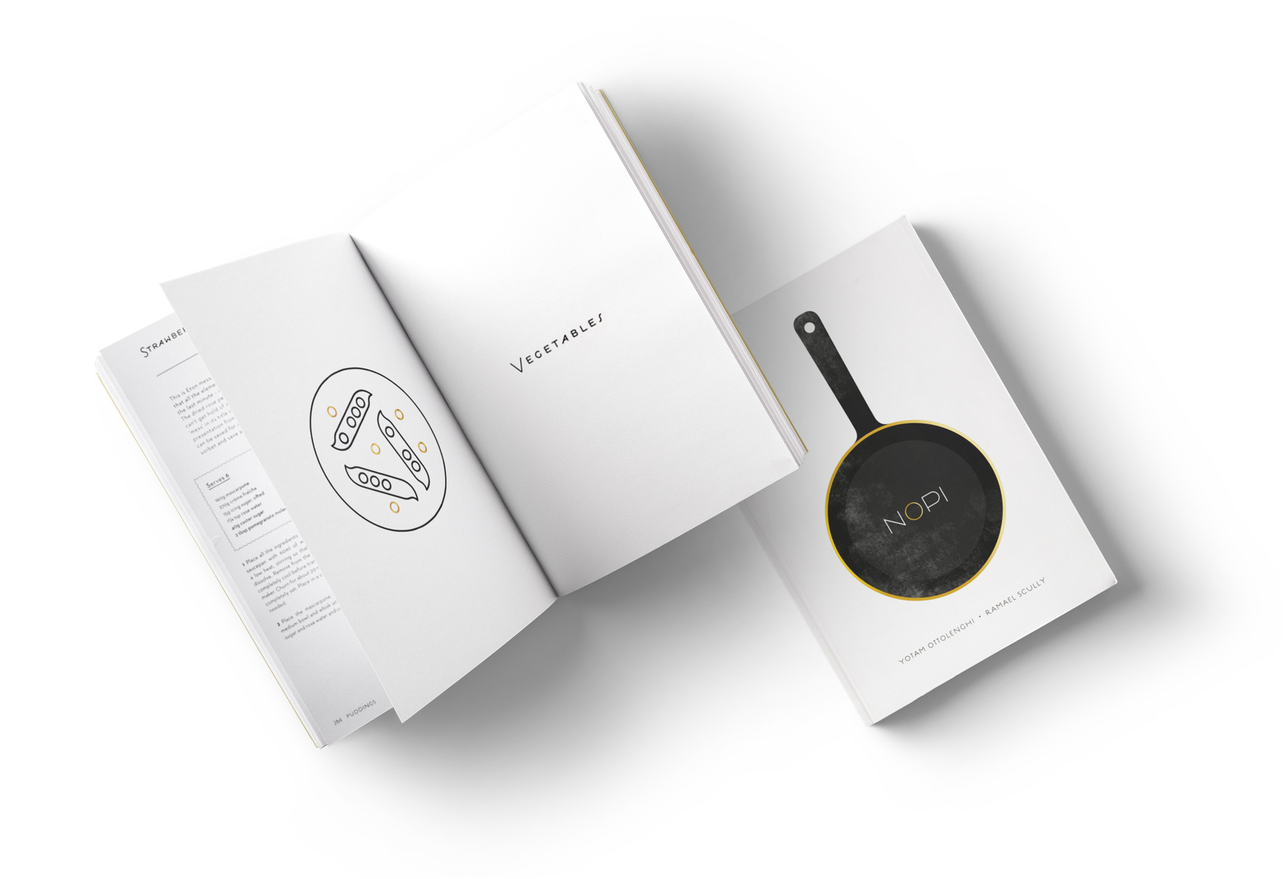
We need to make it look as good as NOPI.
There was just one problem: they didn’t look the part. Their site and brand wasn’t doing the content justice and didn’t reflect internal publishing standards. TasteBook was a portfolio of high-quality editorial brands, and we needed to change that perception. The new brand needed to surpass the high visual standards of the print publishers and be able to proudly sit on a shelf next to one of their beautiful cookbooks.
In This Case Study

Part
1
Strategy
Quality over quantity.
First, we needed a strong strategic foundation. A great digital strategy sets us up for success in design, content and for the brand’s future. TasteBook wanted to shift their audience from the “Allrecipes” crowd to the “Bon Appetit” crowd. This new target was younger, more metropolitan, and more likely to think of food as a creative outlet. We wanted to reach people who were interested in more than just getting dinner on the table, but the cooking-as-a-lifestyle consumers of high-end cookbooks. This meant retargeting TasteBook’s content to a narrower group of food enthusiasts.
It was a difficult and bold decision on the part of our client to sacrifice existing content, users and traffic to pursue a more focused mission. But shaking off the casual recipe hunter meant we could better serve a higher-end market. This strategic repositioning gave us permission to develop a new name (Taste!), a new brand, an editorial niche and a new site that helped editors and authors make and present beautiful content.
“With our new brand, we can’t continue to be all things to all people.”
Kate Rados
VP, Digital Community, Taste
But, there was still a lot of baggage around the existing TasteBook.com site, inside and outside of the organization. So, armed with some post-it notes, we started to define our strategic foundation for the project:
- Build something we’re proud of
- Engage our readers and build trust
- Create a platform for great editorial work
- Create a flexible brand and site that can grow over time
Part
2
Branding
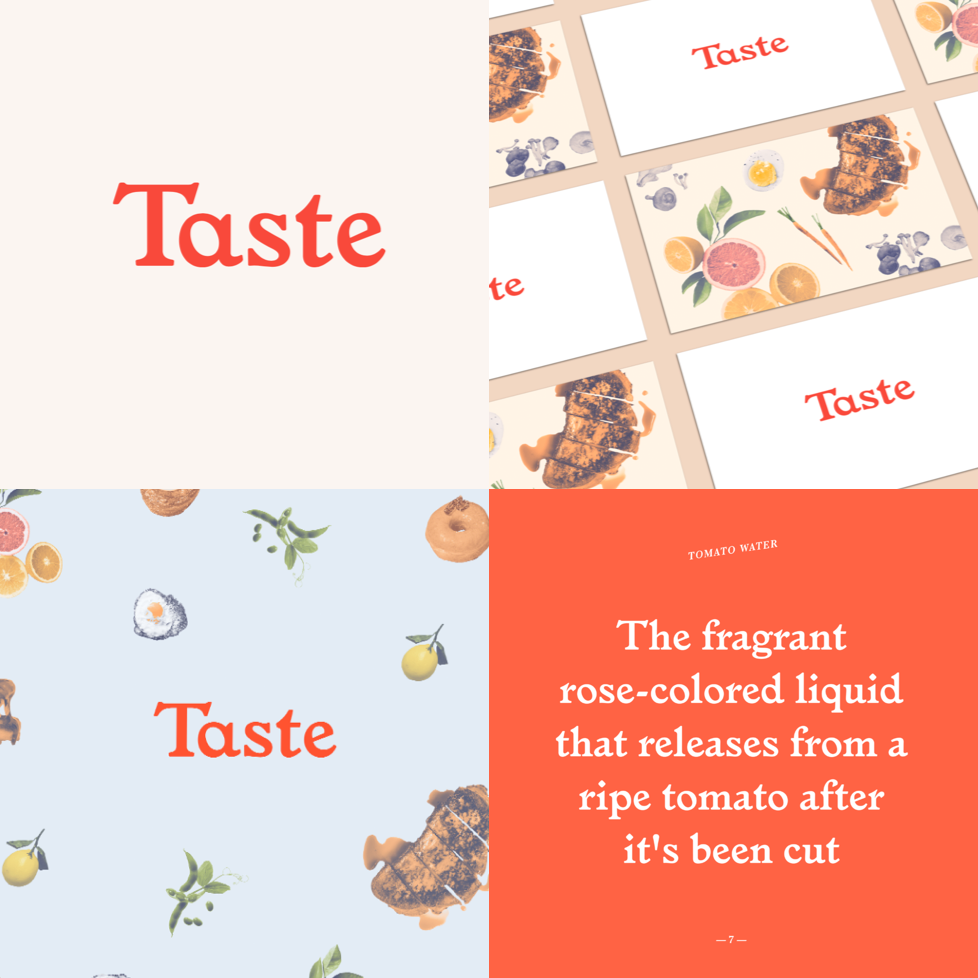
Finding a new name and visual language.
Taste was in need of a design system that would build community, support publishing, increase name recognition, and establish credibility. To start, we defined a set of brand attributes. Through interviews with stakeholders at Taste, we determined that the new identity needed to be accessible to foodies of all levels, inspiring in breadth and depth, sophisticated in style, and trustworthy in quality. And of course, it needed to be fun. We drew visual inspiration from high-end lifestyle magazines, cookbook layouts, boutique food packaging, and interviews with food lovers and afficionados.
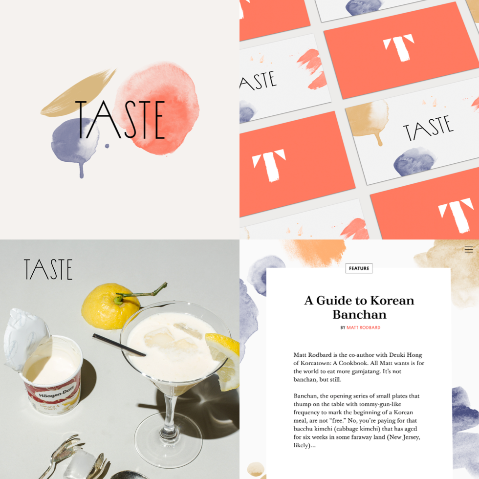
We developed a spread of brand directions, each dialing up and down different brand attributes. One direction was vintage and quirky, another was elegant and painterly, each of these options inspiring the client team and giving us more material to draw from. Ultimately we ended up with a healthy mix of each direction, dominated by some of the classier variations on the logotype and tempered with the quirkier and more personality-driven aspects of the brand ideas.
Accessible
Inspiring
Sophisticated
Fun
Accessible
Inspiring
Sophisticated
Fun
Accessible
Inspiring
Sophisticated
Fun
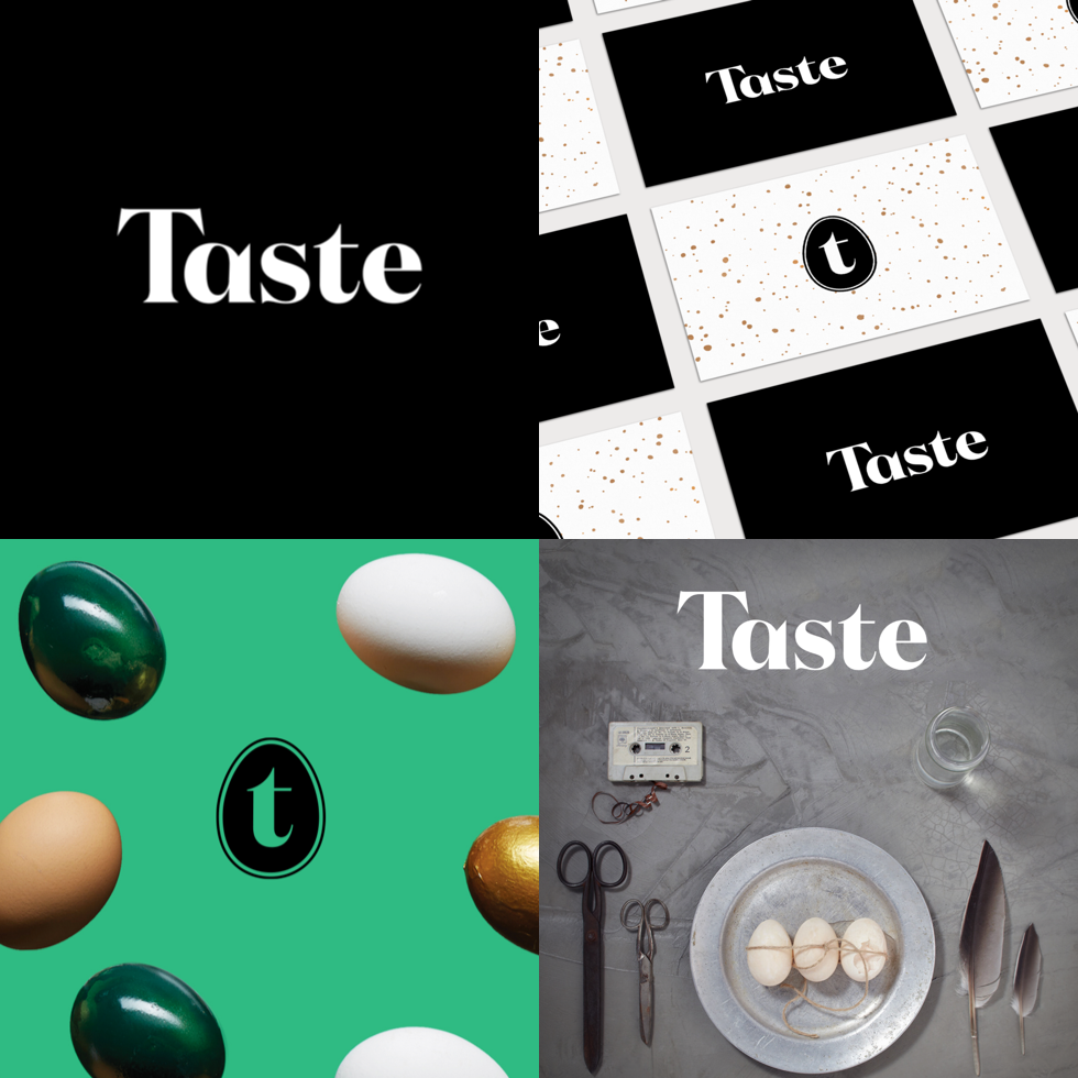
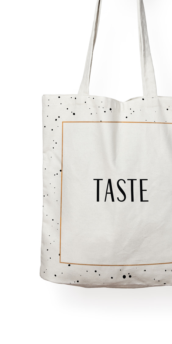
The Logo
A Tough Nut to Crack
How do you design a logo without a name? Designing everything else around the logo was a good place to start, but with a handful of name options still swirling around we took the plunge and started making logos. Once we decided that our headline typeface would be Tusar Deco, we knew the logotype had to be elegant and simple. It needed to contrast the quirky exuberance of article headlines.
We ended up producing a custom set of letters, loosely based on the Britannic typeface. Britannic’s tall and proud letterforms inspired us to draw classy gridded letters, like something from a high-end fashion magazine. Paired with Tusar Deco and an adorable egg icon, we were able to hit the right balance of down-to-Earth sophistication. It also turns out that drawing a great “S” from scratch is harder than it seems.

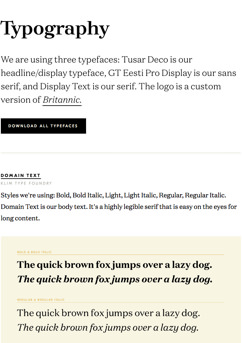
Typography
Sophisticated Approachability
Tusar Deco, our headline typeface, has enough personality to fill a room so we needed to combine it with something simple. We chose GT Eesti and Domaine Text as our trusty backup singers. We used Domaine for body copy, since Tusar Deco gets points for flair but not for legibility at small sizes.


Brand Guide
Completing the System
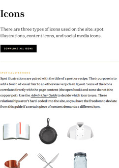
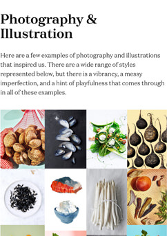
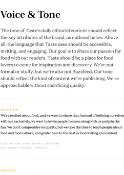
We packaged all of this information into a streamlined brand guide, which lives on the site. It includes the essentials: a type guide, a color guide, logo applications, a collection of spot illustrations, voice and tone guidance, and photography inspiration. It's also an easy place for Taste to download assets.
Why is this useful? Design doesn’t stop after Upstatement steps away. A brand guide helps maintain consistency across designers, across companies and within Taste. It's the single source of truth as the brand is carried forward and grows beyond what one designer can possibly maintain. We believe that almost no project is complete without a basic brand guide. This type of documentation vastly improves the translation from our team to yours.
Part
3
Site Design
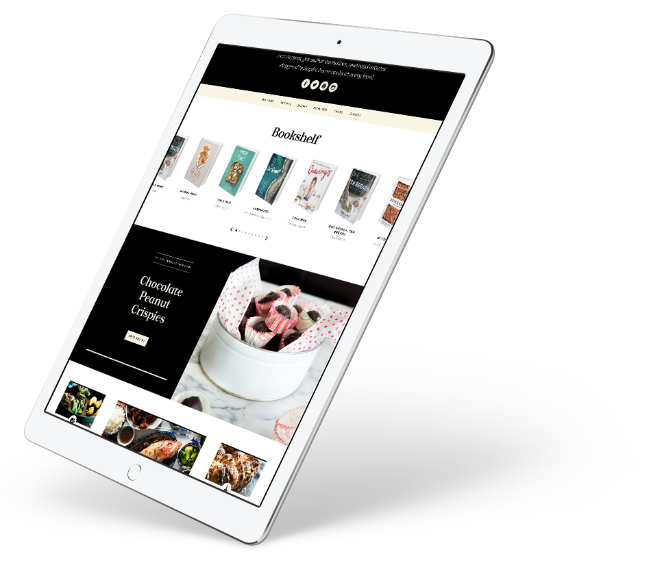
A Better Online Recipe.

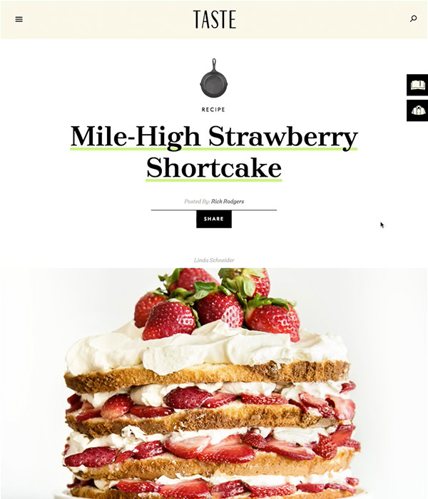
Kitchen Mindsets
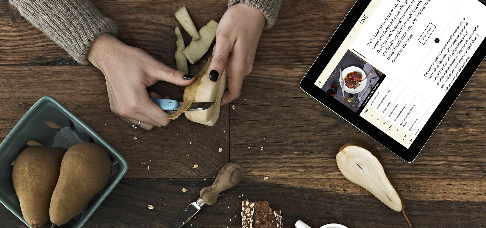
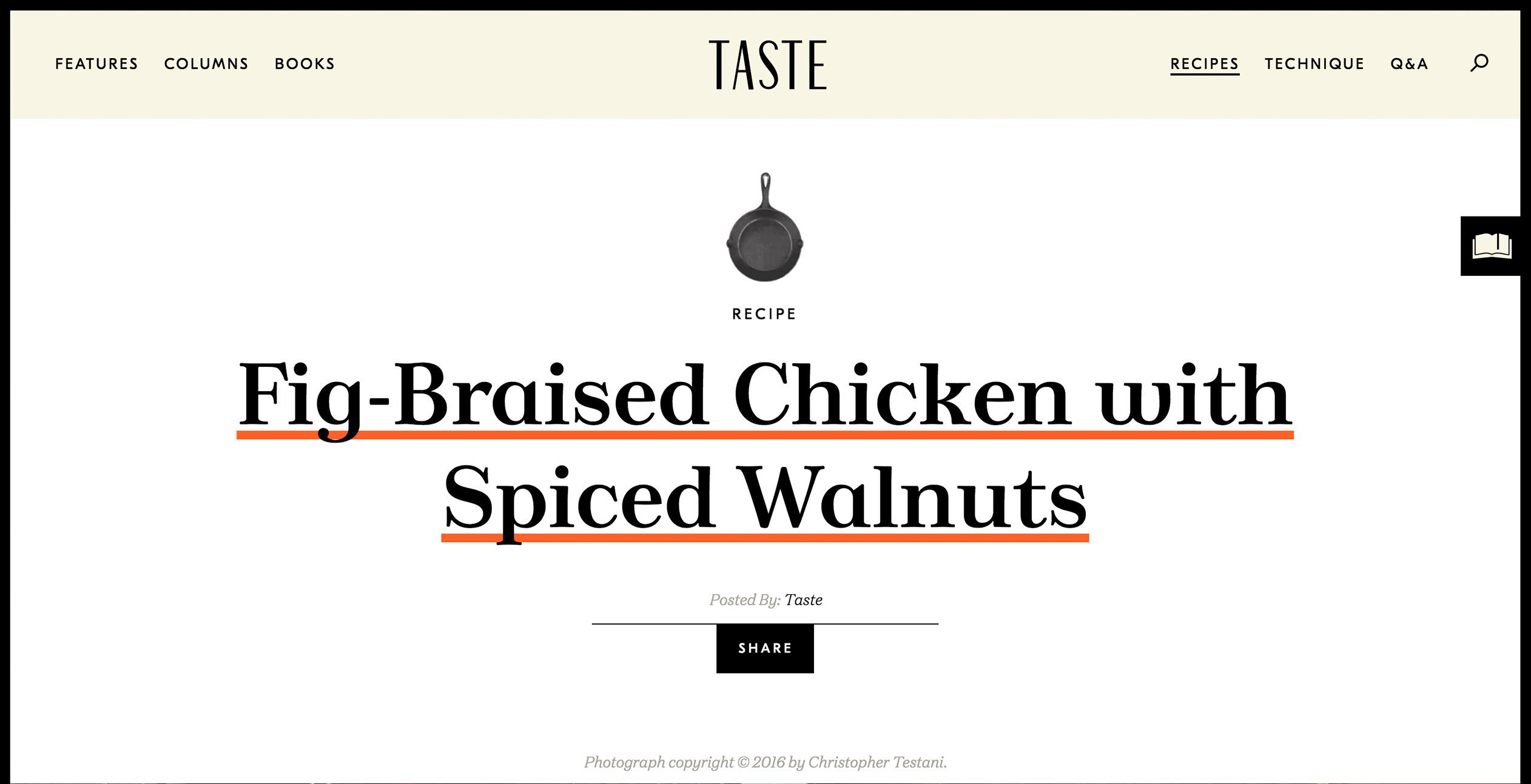
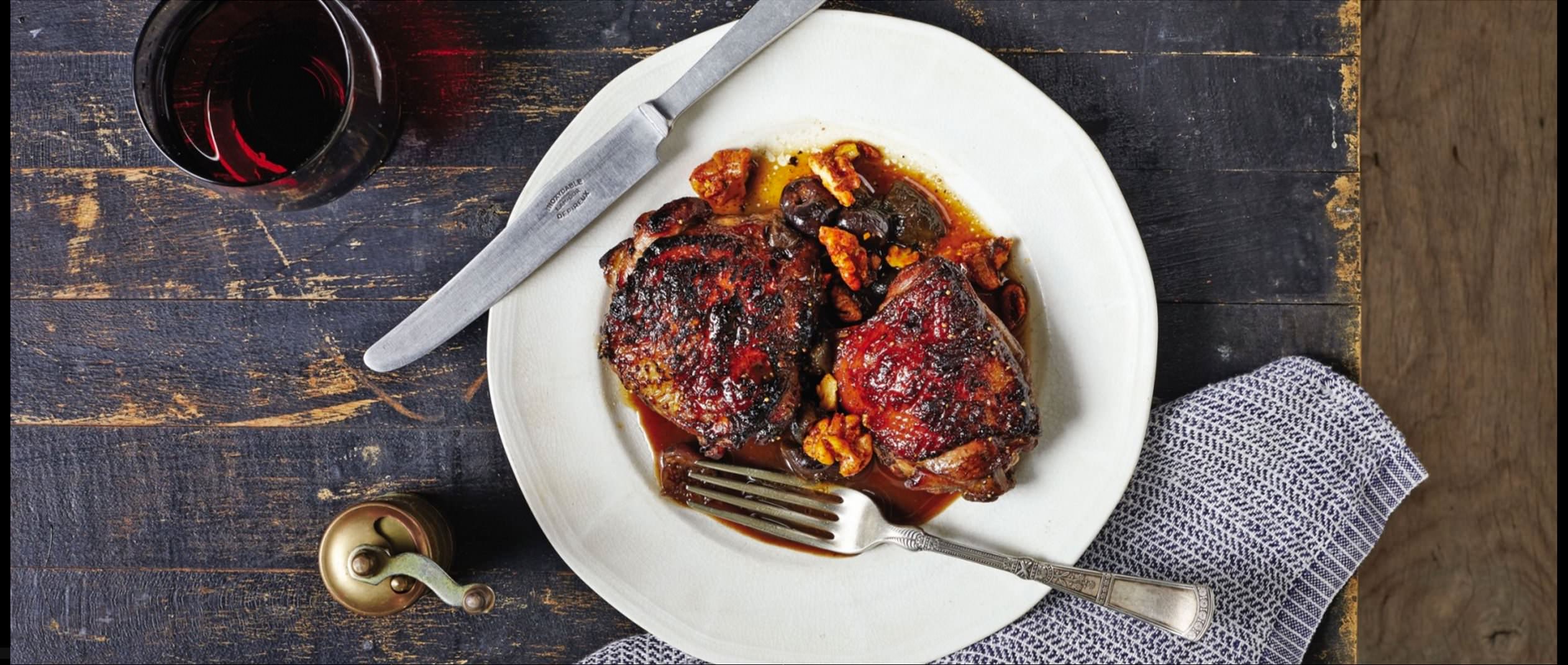
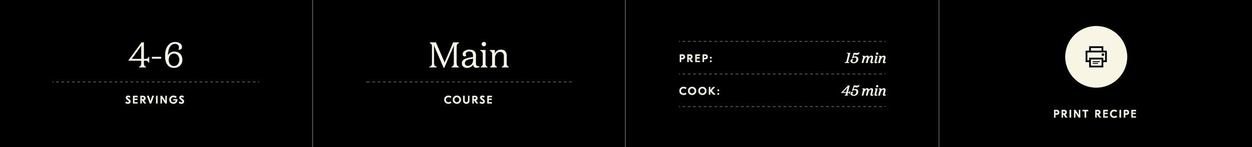
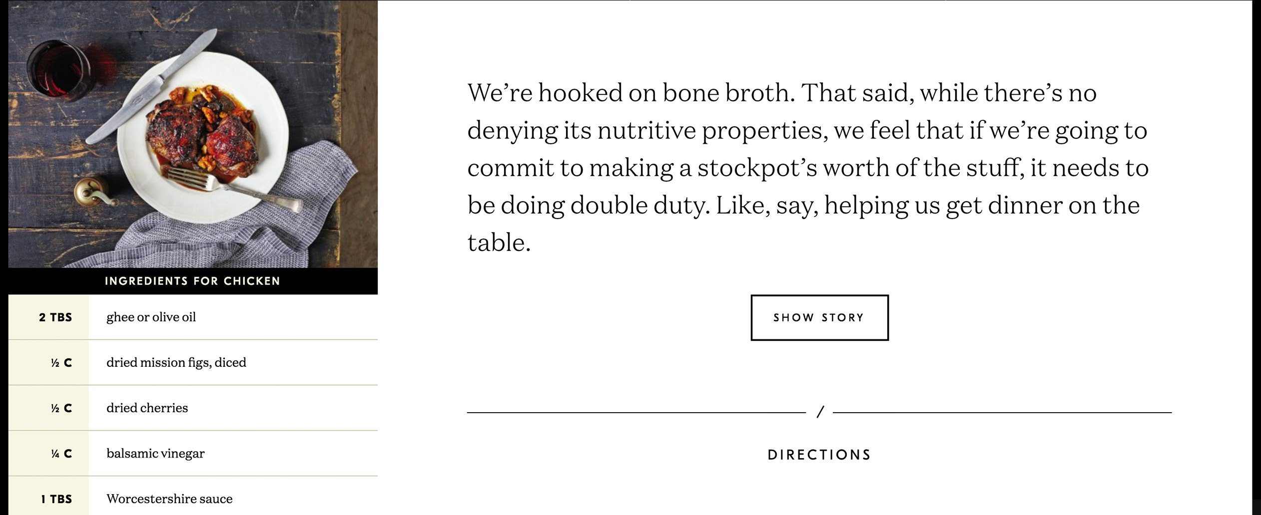
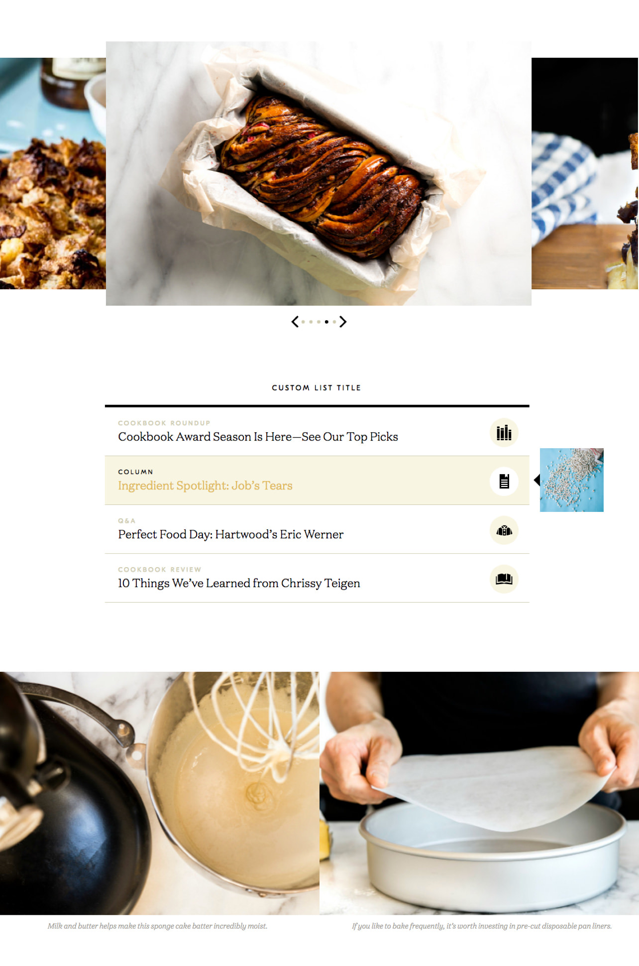
We’ve all been there. You're trying to cook something from your laptop or phone, arms smeared with chocolate and buttercream frosting, and despite miles of scrolling with your clean pinky finger, you can’t find the list of ingredients. Or a popup ad is blocking your view of step 4. Or the type is so small that you sliced instead of diced. We knew online recipes were one area where we could really improve the experience for the vast majority of home cooks. So we started by identifying two mindsets to design for: cooking mode and browsing mode.
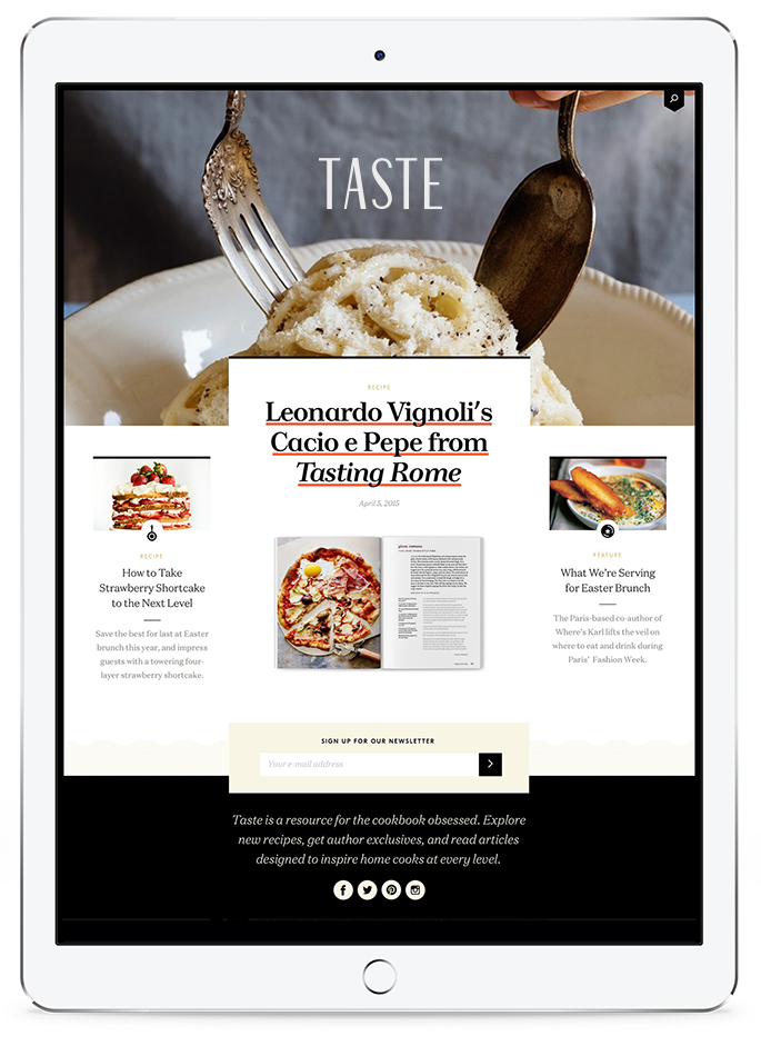
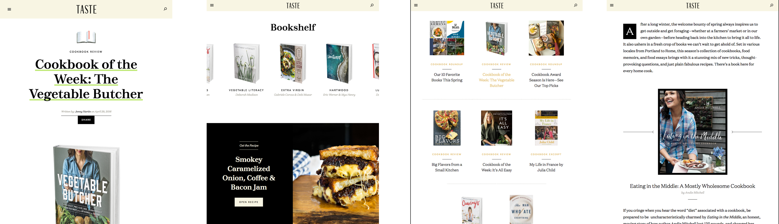
Books & Authors
Selling without Selling Out
At the end of the day, Random House wants to sell books, but Taste didn't want to SELL sell books. Our marketing strategy was to play the long game. We promoted the brand and experience first, and knew that book sales would follow. Part of building brand credibility meant celebrating ALL cookbooks, not just the ones published by Penguin Random House imprints. This might seem counter-intuitive, but humans don’t shop for cookbooks by publisher name. We believed that building trust would ultimately lead to sales, and that some portion of those sales would be Penguin Random House books.
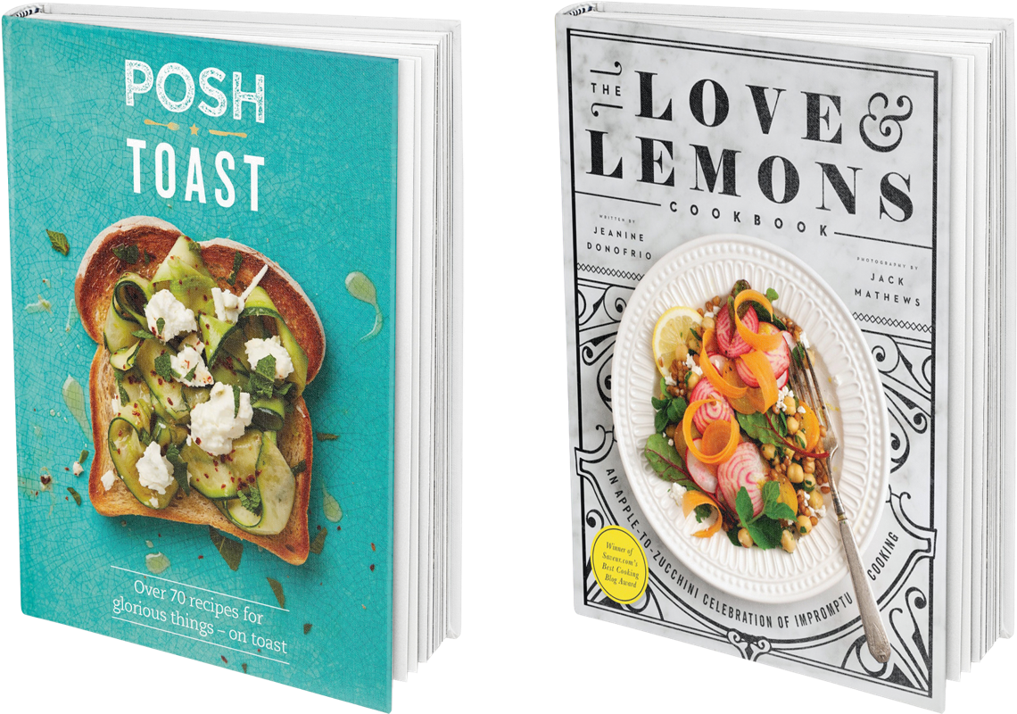
One of Taste's differentiators is their proximity to the top of the publishing funnel. Random House's cookbooks are desirable objects with photography and design that make people want them. The site needed to showcase books as tangible objects and build Taste’s credibility through cookbook reviews, excerpts and “best of” lists.
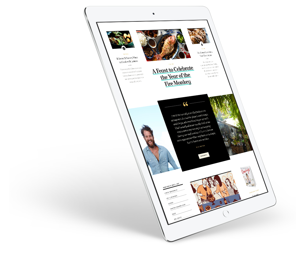
The Reading Experience
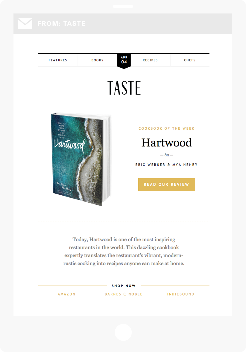
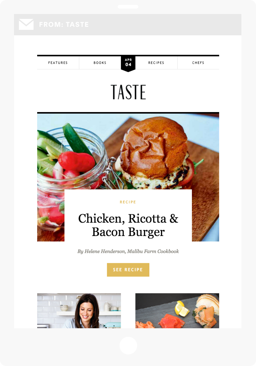
When we first met Taste, they were publishing a lot of great material but there wasn't an underlying approach to content that could drive prioritized decision-making. We broke down their content by type, audience, and effort required to publish. This revealed clear choices about where to focus energy to get the most bang for our buck out of each piece of content.
We also needed to extend these improvements beyond the website. Taste's existing email newsletter was an extremely important distribution channel and we need to make sure that the email experience was on par with the site experience.
“We're creating a place of discovery, where people who are interested in food, cooking and culture will be excited to discover new voices and have a rich environment that inspires people them cook”
Part
4
Technology
30,000 recipes? Sounds delicious!
A Unique Site Needs a
One-of-a-kind Back End
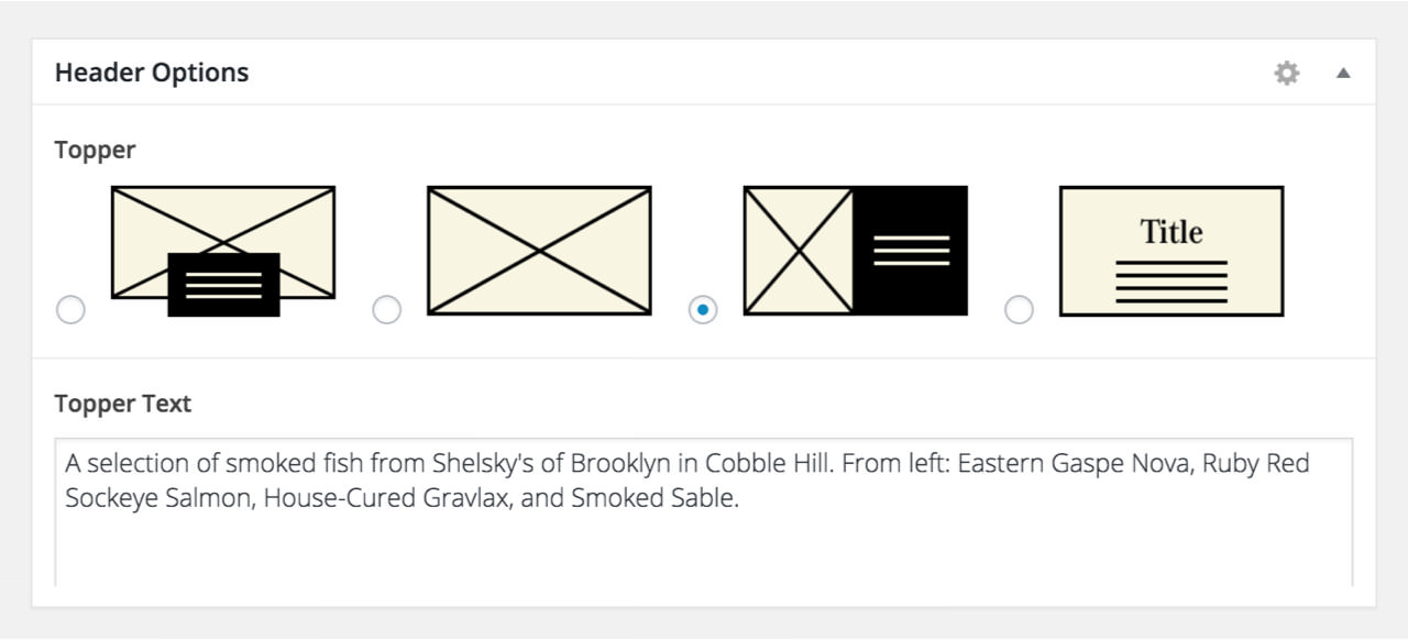
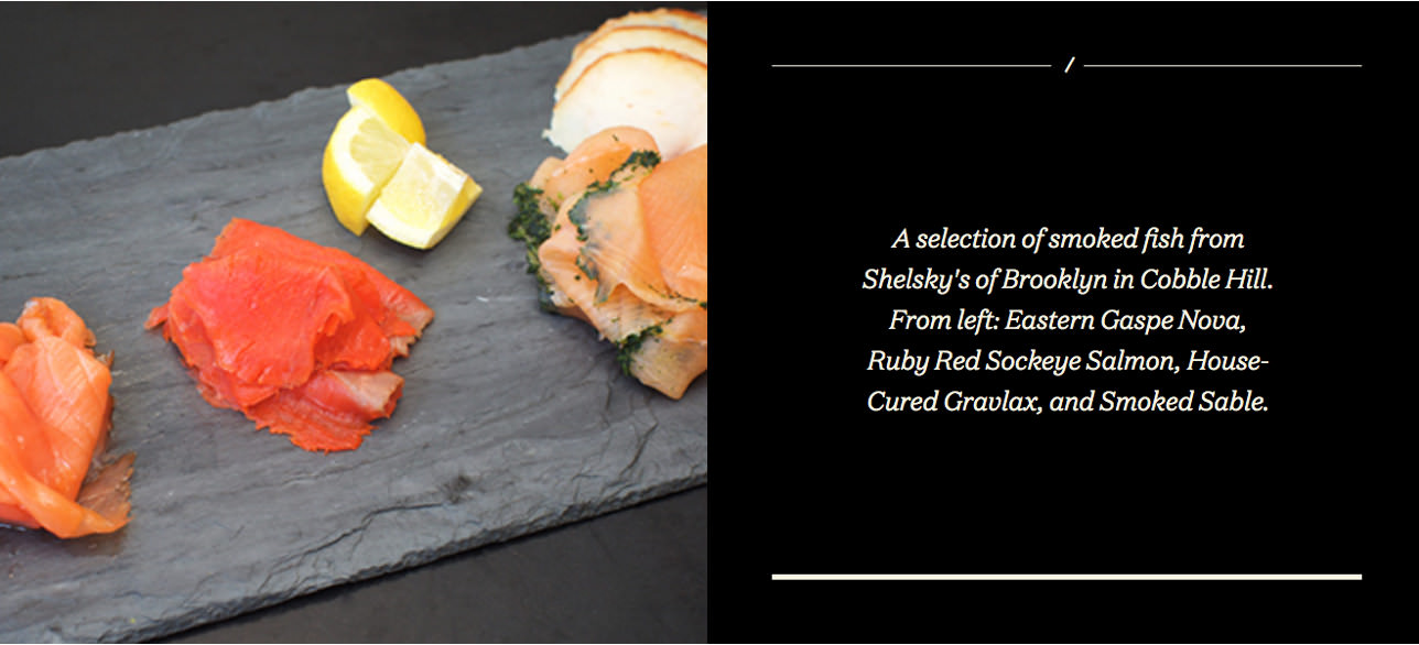
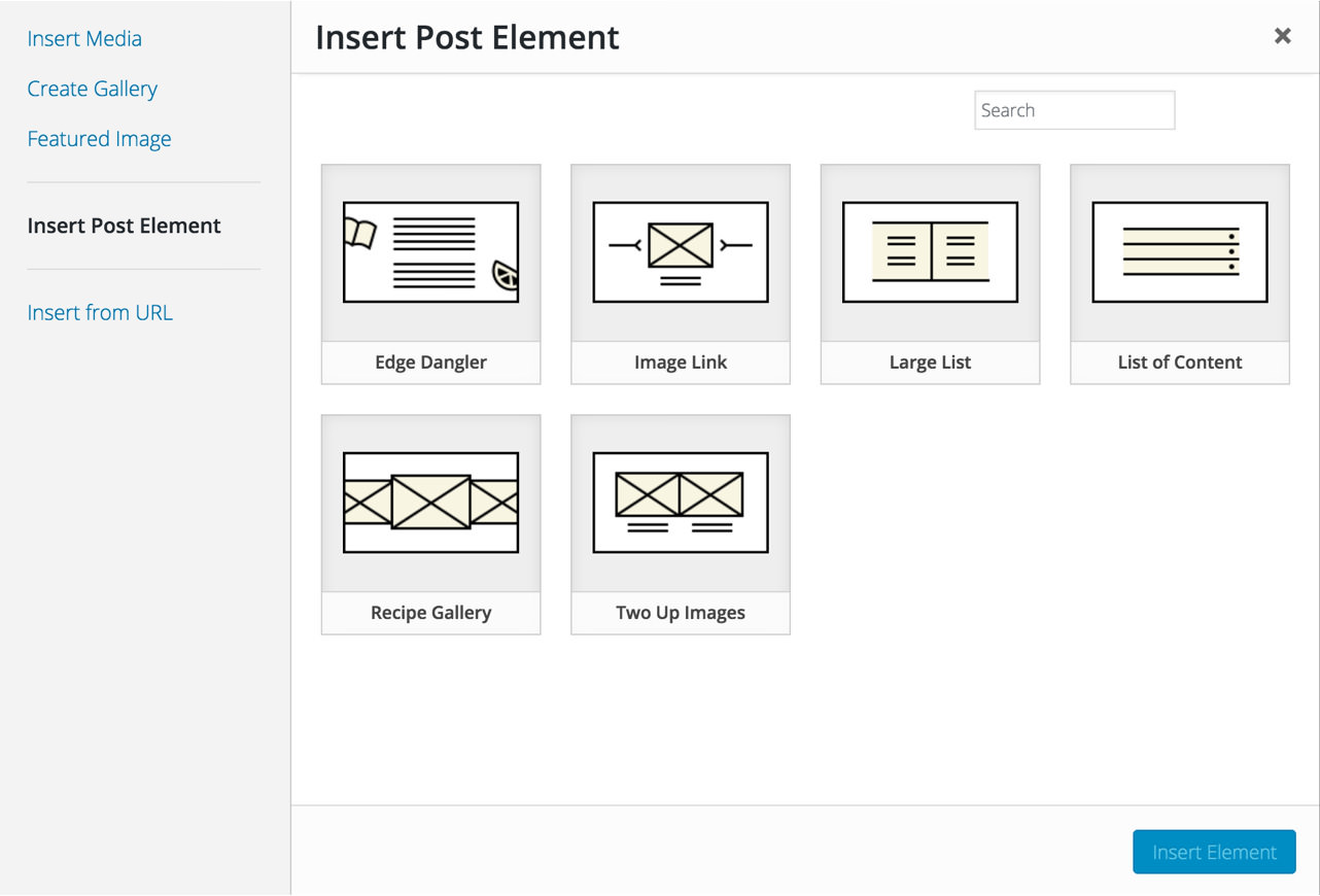
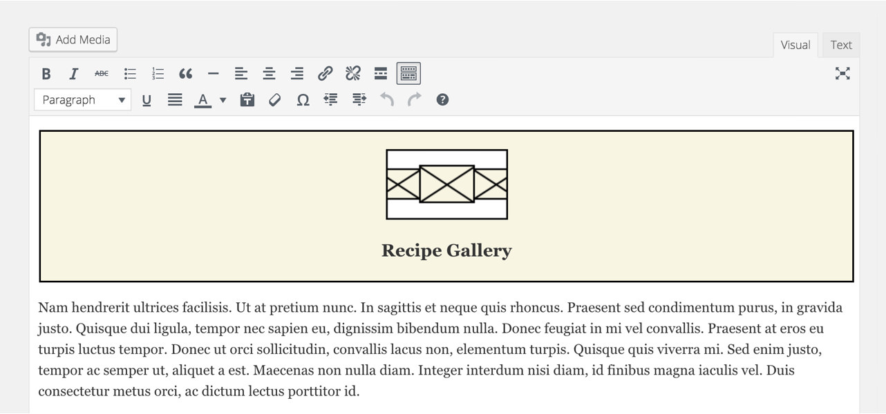
The design made for a tasty user experience and we wanted to make sure writers and editors had everything they needed to make great content. We built a handful of custom components in the WordPress admin that could be inserted as shortcodes. The workflow we designed makes it easy for an editor to add these shortcodes, which encourages our ultimate goal of creating textured and creative editorial content.
A Recipe for Recipes
Recipes are a very unique content type, and this site's stock-in-trade. Following our agile design and dev principles, this was actually one of the first features we built in the early days of the project — even before naming and design were even kicked off. By starting with the core of the content and user experience, we ensured that the most critical parts of the site got the most development attention.


To accomplish our requirements around recipes and all of the other content Taste was publishing, we built a custom WordPress platform, using Timber to separate the markup and the PHP. We also leveraged Upbase, our in-house SASS library, to expedite front-end styling. We did a fair amount of design in the browser, and Timber and Upbase made agile design iteration a lot quicker.
Making the Switch
Armed with a solid strategy, we needed to help Taste follow through on their promise of quality over quantity. With over 1.4 million recipes, they needed to cull the herd. So, we got to work on the four parts of a successful content migration:

Decide what to migrate and what to kill (and why). For Taste, this meant cherry-picking the best 30,000 recipes.
The client team prepares their data. In our case, Taste used scripts that we had written to efficiently organize, normalize, and tighten an incredible amount of information.
Make the handshake between client data and our team. The internal developers at Taste played a critical role in making this handoff seamless.
Design a front-end that anticipates the needs of both old and new content and seamlessly bridges the gap. We delivered an experience for legacy recipes that integrated old and new recipes.

What We Did
- Research
- Content Strategy
- Brand Design
- Naming
- UX Design
- Front-End Dev
- CMS Development
- Content Migration