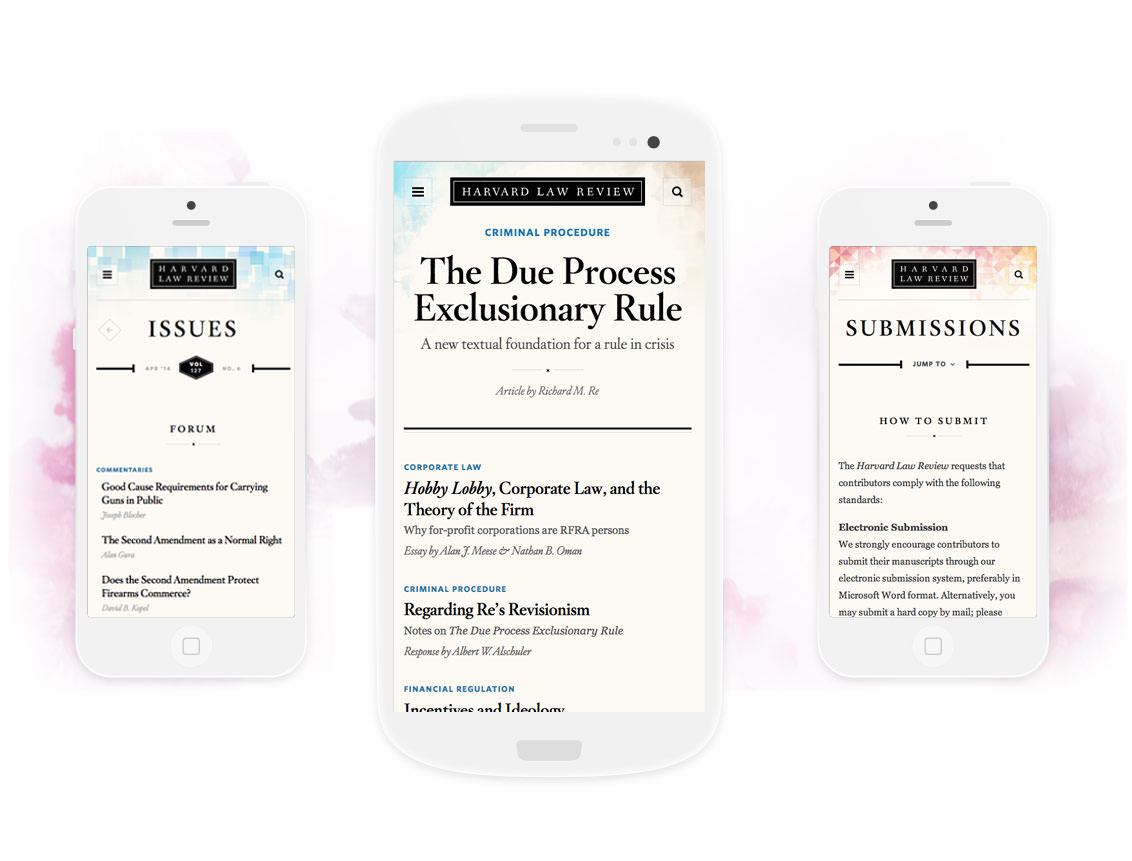
Responsive Design
Harvard Law Review
No photos in over 127 years? No problem.
How we designed a beautiful, responsive website for the world’s most prestigious law journal.
Once upon a time, every serious law practitioner subscribed to the Harvard Law Review. Every month, the latest issue would land on the desks of lawyers, judges, and law firms. But times changed. The internet proliferated. Subscriptions to the print edition plummeted. And something was lost.
Of course, the Law Review is still widely read, respected, and referenced. However, legal professionals are more likely to search for a specific story in Westlaw or Nexis (the massive digital libraries) than browse the latest issue on HLR’s website. Our redesign aims to change that. While the website can’t hope to compete with Westlaw’s powerful search and annotation tools, the new design re-establishes it as destination for reading and browsing.
Blending Form & Function
We worked closely with the Harvard Law Review staff to make the new website part of its audience’s reading ritual. The staff now publishes more frequently (weekly instead of monthly) and the homepage trumpets each new story. The site also encourages browsing by introducing more serendipitous ways to find stories.
The design itself is both beautiful and functional. The typography is thoroughly modern while remaining firmly rooted in the publication’s history. The site’s long stories (many count more than 3,000 words) are thoughtfully designed for a focused, unfussy reading experience. And every last detail is polished to shine, from the smallcaps in headlines to the animations on footnotes.
A DESIGN DILEMMA
Not One Single Photo in 127 Years
Amazingly, after publishing for more than a century, the Harvard Law Review hasn’t printed a single photograph. That creates quite a dilemma for the designer. What do you do when you can’t count on art — ever?
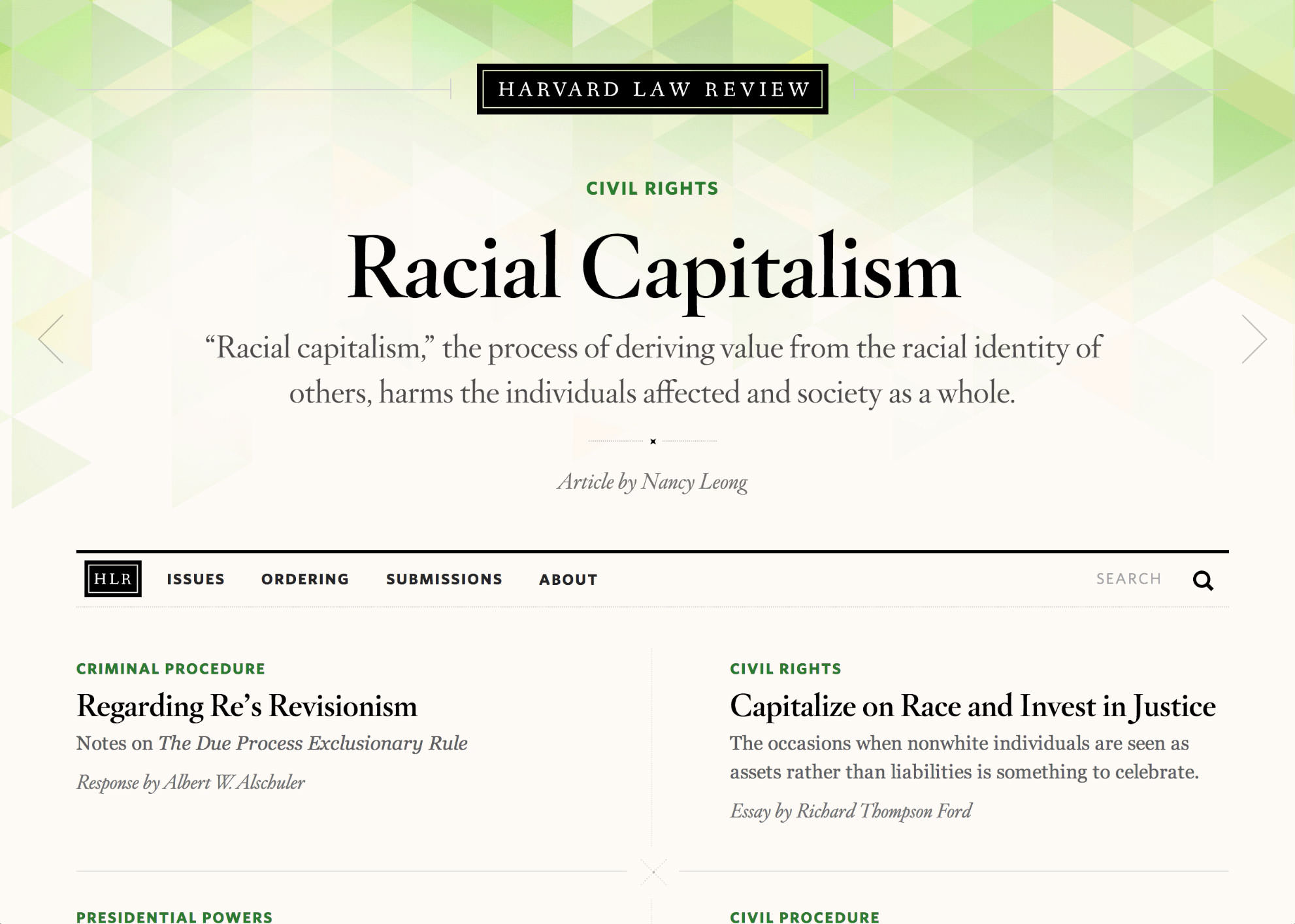
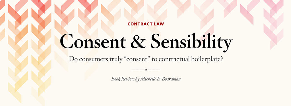
Our answer came with a big assist from talented designer Carol Liao. Together, we illustrated 50 different background patterns that add texture and meaning — the patterns are more than just decoration. On the homepage, the background changes each time a new lead story appears. Each new issue also receives a unique color & texture, and all stories within an issue share the same background.
TYPOGRAPHY
Finding the Perfect Font
For as long as we could tell, the Law Review employed a serif called Old Style 7 as its signature typeface. With respect to their heritage, we tried it in early prototypes. That experiment didn’t last long. While it’s a lovely typeface, we soon realized it had never been fully hinted, optimized, or properly spaced for the web. It looked clumsy at large sizes — a role it never plays in the printed publication. Old Style simply couldn’t do the lifting required for a site defined by its typography. So we set out to find a worthy replacement.

Old Style 7
Hoefler Text

Luckily, we found an answer in the first place we looked. We reached straight for Hoefler Text and set it side-by-side with Old Style 7 for comparison. Hoefler Text felt like a perfect proxy. It evoked the same era and shared some very specific design choices, right down to individual characters. Just look at the lowercase italic k, below.

Old Style 7

Hoefler Text
Both use a rounded bowl for the northeast stroke and add a playful finial to the foot. Hoefler feels more refined, but similarities like these helped make the case for replacing a typeface with a long legacy. To our eye, Hoefler Text & Titling looks like the prettier, more stylish sister of Old Style 7.
Type in use on the final site
▼
ARTICLES
The Long & Short of It
You immediately notice two things about Harvard Law Review articles. First, they are long. Very long. Most of the main pieces clock in at over 3,000 words. Second, each marquee story contains a ton of footnotes. We strove to make these long texts easy on the eyes and to solve the persnickety problem of switching between the main text and footnotes.
We tackled the readability challenges by designing several levels of hierarchical headers that help chunk the stories into more digestible pieces. Editors can also use custom teases, contextual elements, and pullquotes that supplement the story and give the reader both a rest and a point of reference. You can see all the design options in the stylebook we created for the staff.
FOOTNOTES
Keeping Everything in Context
Reading digital texts with footnotes has always bothered us. Pro tip: Don’t try to read David Foster Wallace’s “Consider the Lobster” on a first generation Kindle. It takes at least five clicks to select the footnote, open it, and return to the text. It breaks the reading experience.
While the Law Review’s footnotes aren’t as epic as Wallace’s, they are certainly more frequent. We devised a system that minimizes reading disruption. No matter the screen size, footnotes are always close at hand. On mobile, you tap to read the footnote right in place. When you finish reading it, you’re right where you left off in the text. Once there’s enough screen real estate, the footnote pops out of the main body and sits in the margin. The reader need only glance to read the footnote and resume their place.
CONCLUSION
Sweating the Details
For a site like Harvard Law Review, it’s easy to focus the story on its overall design. But we’re most proud of the detail work — things that might be invisible to a casual observer but make all the difference for the Law Review’s audience and staff.
On the dev side, we coded the site using Timber, Upstatement’s plugin for writing clean, maintainable markup in Wordpress. We also created custom admin screens that make it easy for editors to add footnotes and manage their homepage.
On the design side, we massaged even the most minuscule type details while working hard to make the popular submission form more accessible and improve navigation through smart search, which completes your query as you type, just like Google.
We also made sure the site works beautifully on devices of all shapes, sizes, and capabilities. The responsive approach is key to helping HLR to regain its place in the homes and offices (and pockets and purses) of legal professionals everywhere.