New Work
Amplifying the voice of the American securities industry
A website for SIFMA that breaks content free and brings data front and center
SIFMA provides curated data resources that policymakers and members of the financial regulatory community rely on. Those resources drove most of the traffic to the site, but they were also difficult to explore and deeply siloed. We love that we were able to refocus SIFMA’s most valuable information and make it easily reachable.
The new, dynamic search maintains the granular detail that once made the content difficult to navigate, but the detail no longer gets in the way of the content. It’s part of the experience. The content needed an easy to traverse typographic system regardless of the content’s density, and a responsive environment that could provide reference to any related search term fast. In the end, search was transformed into a feature that leverages both typography and interactivity to give greater control to any of SIFMA’s users.
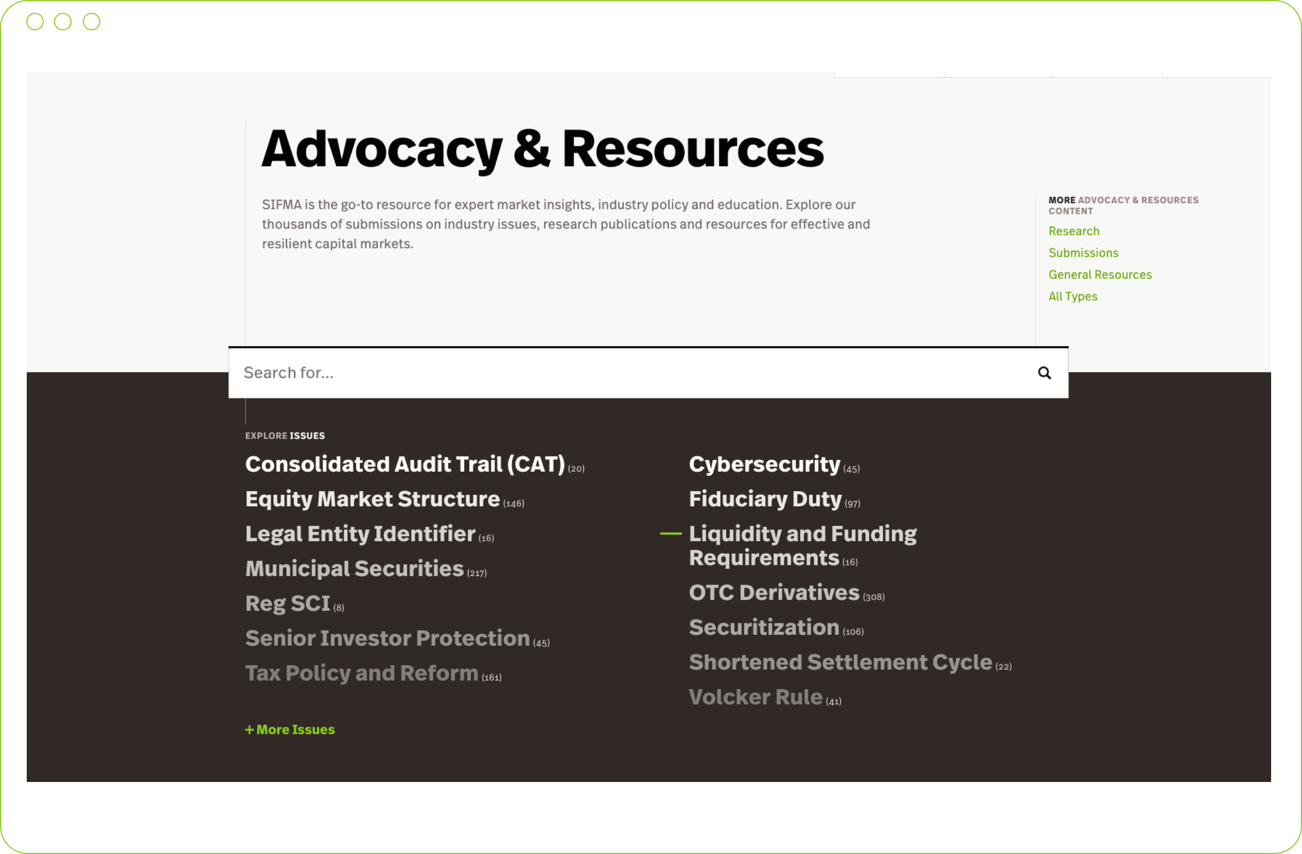

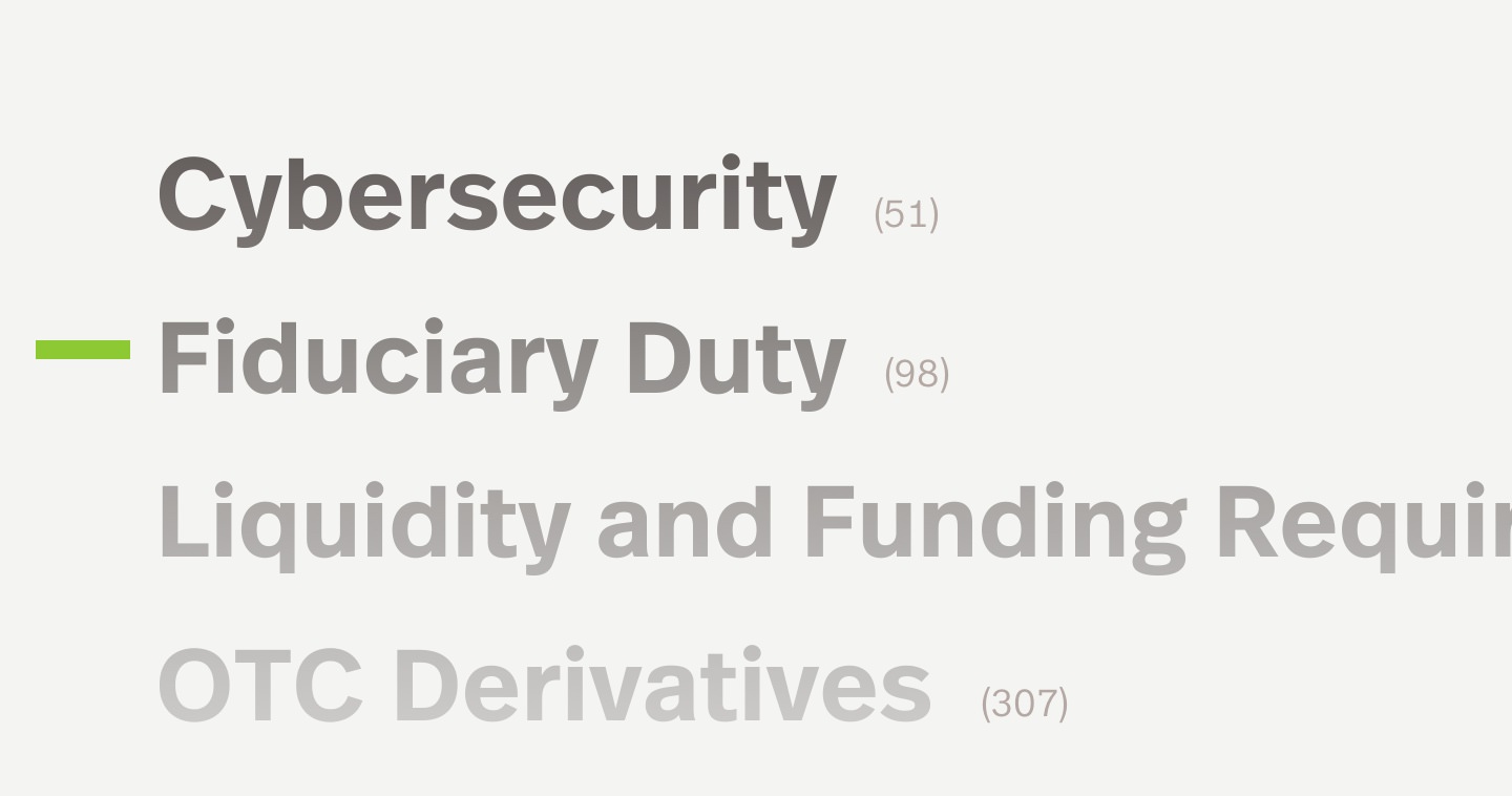
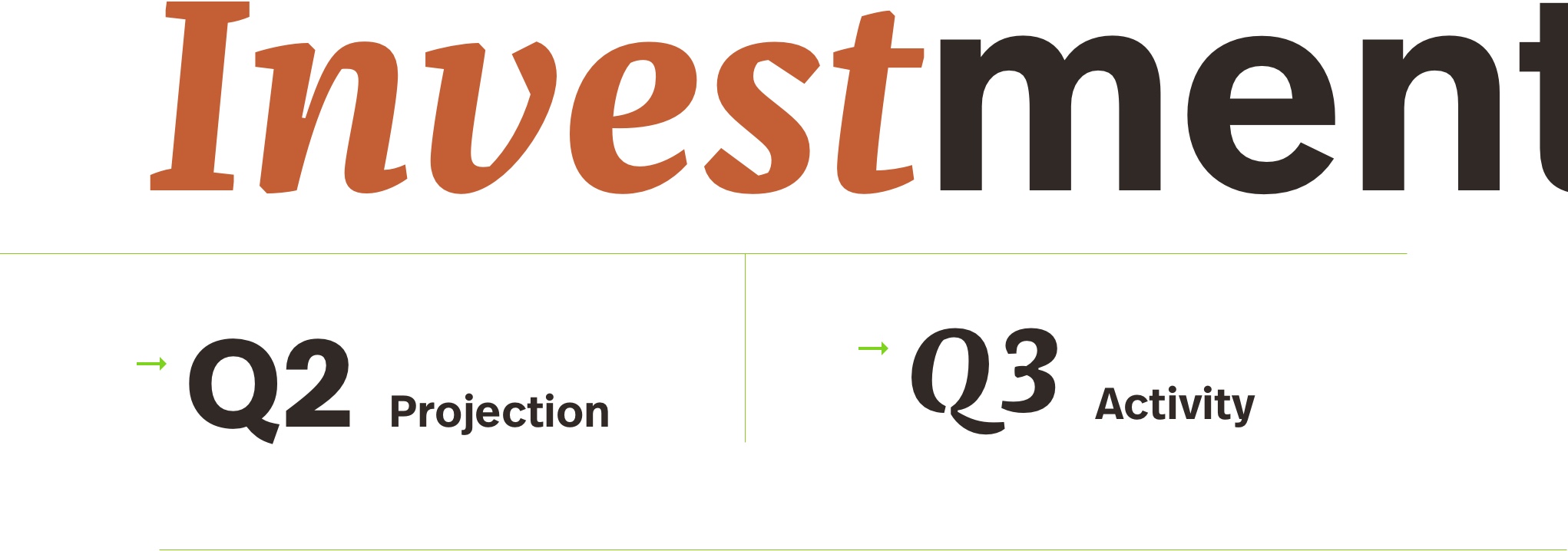

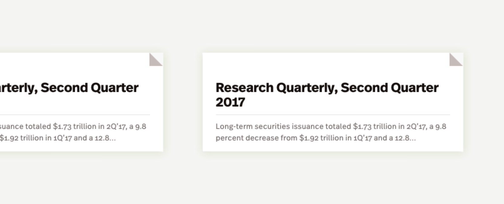
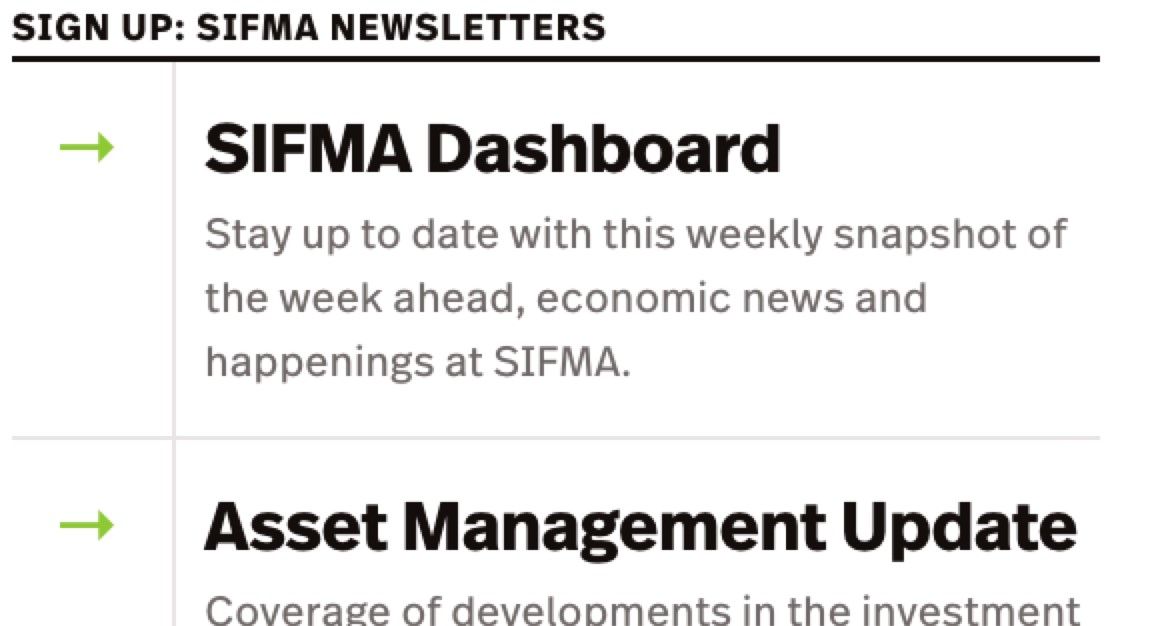
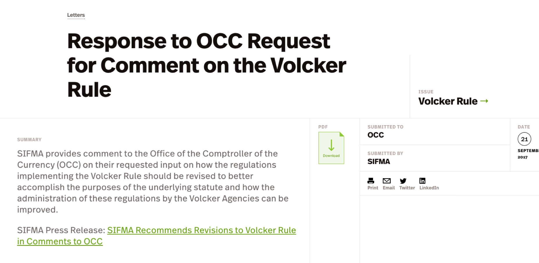
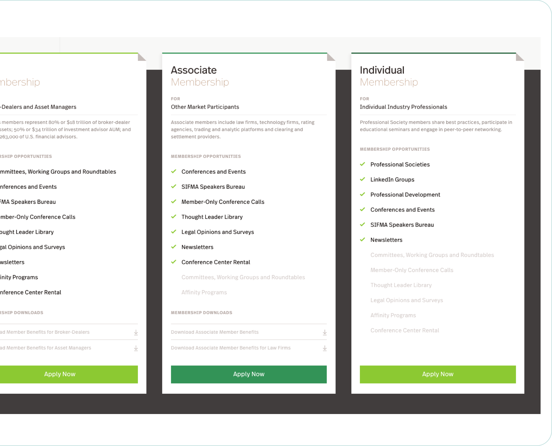
The live search is one of many elements on the site that takes the grid and makes it playful. The site’s dog-eared charts, graphs, and content freed by open gridlines and borders bring unexpected personality to its pages. In the end, the site maintains the maturity and tradition of a storied financial organization like SIFMA, but with an openness and character unique to SIFMA’s mission to provide reliable advocacy for the American securities industry.
Data trapped in downloadable spreadsheets also became one of the pieces of content that Upstatement brought forward in SIFMA’s new site. The interactive charts primarily expose SIFMA’s research and deep data repositories, but also boost engagement and can draw new membership. We love how vibrant and within reach some of SIFMA’s most important information became.
What We Did
- Research
- Content Strategy
- UX Design
- Front-End Dev
- Data Visualization
- Custom Search
- Content Migration

