Responsive Design
Boston Globe
Finding the Soul of The Boston Globe
The first large-scale implementation of responsive design for our alma mater on Morrissey Boulevard.
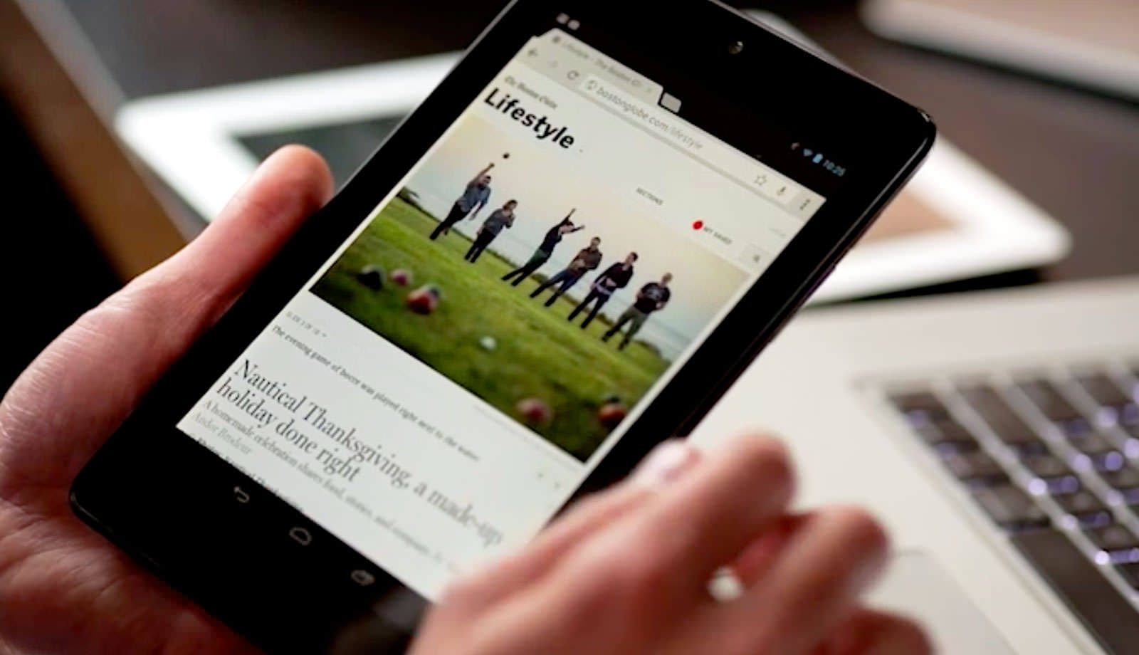
We teamed up with The Boston Globe, Filament Group, and Ethan Marcotte to build a newspaper website for the 21st century. The brand new home of the Boston Globe was designed with the reader foremost in mind and is optimized so it can be read on anything — Android, iPad, laptop, Kindle, 27” iMac, Blackberry, you name it. The site uses a technique called responsive design to serve the same content to everyone while making specific adaptations based on size (How wide is the viewing area?) and capability (Is it touch screen?). Ethan, Scott Jehl, and Filament really pioneered this approach, literally writing the book on the subject.
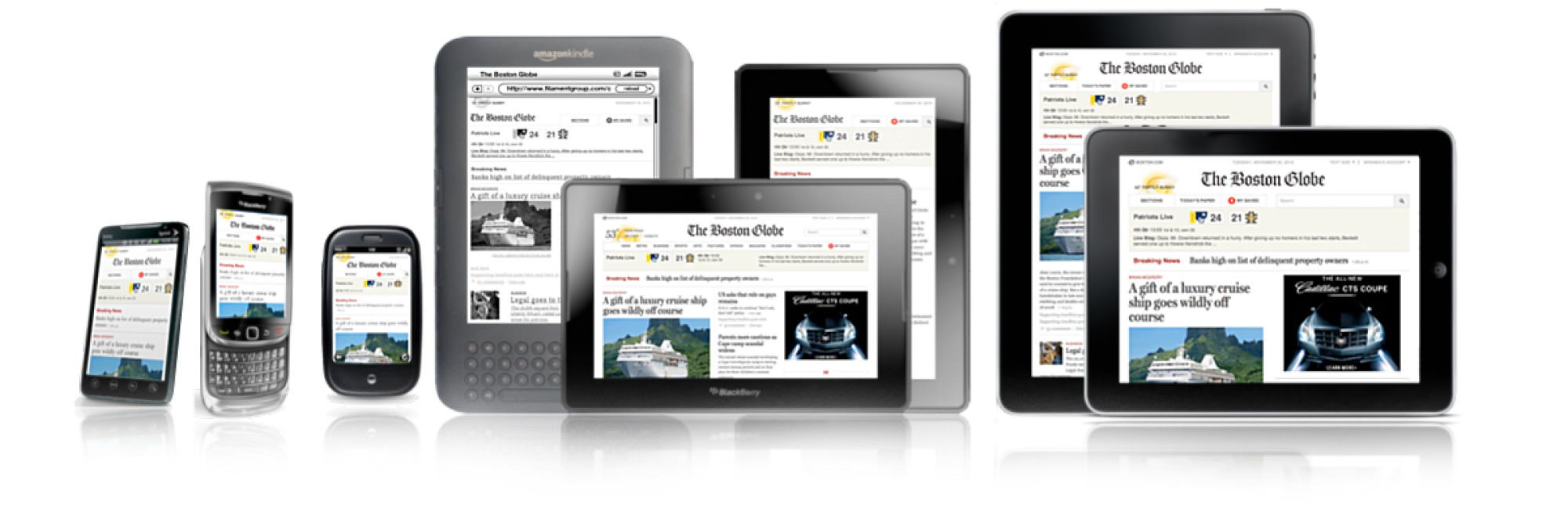
Layouts that Adapt to the News
Most news sites have a single presentation that rarely deviates. On a daily basis, the news must conform to the homepage layout. We always thought it should be the other way around. The layout should change to reflect the moment in time, like a print newspaper front page. We worked with Miranda Mulligan and editors at The Globe to design several flexible approaches that anticipate different photos sizes and news hierarchies.
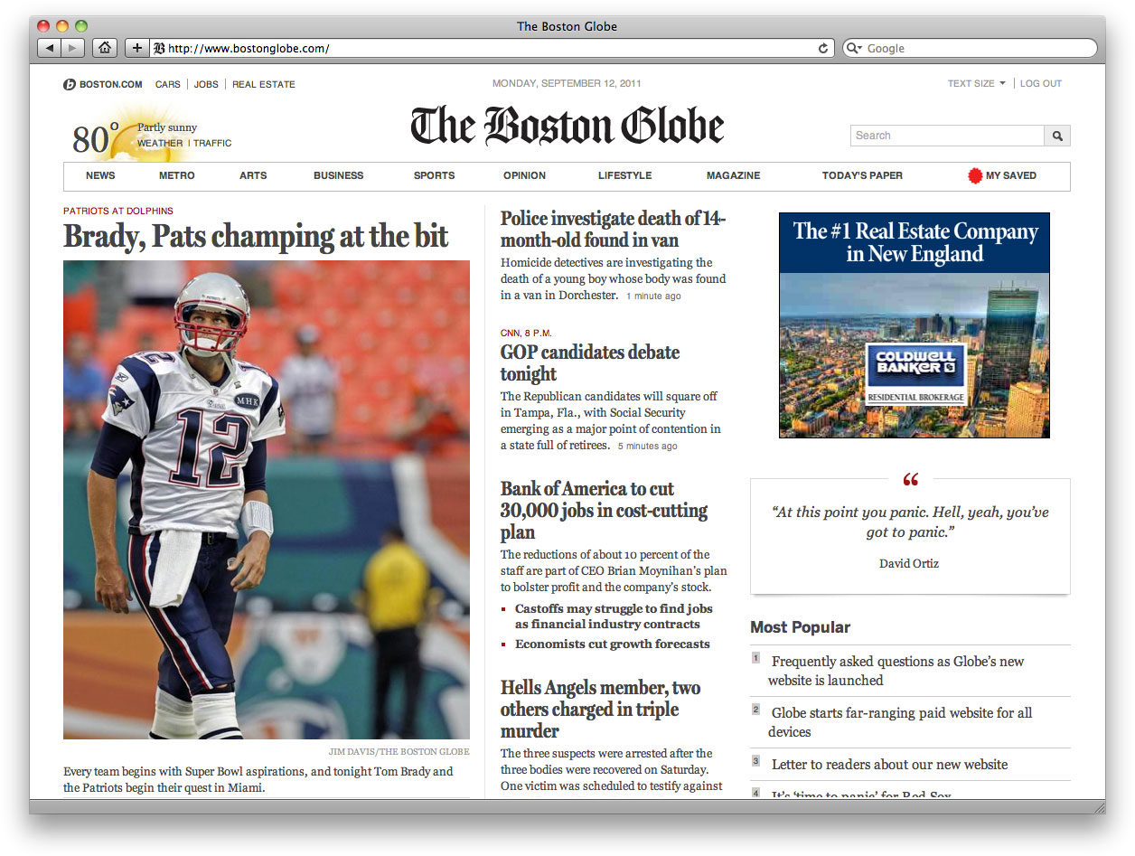
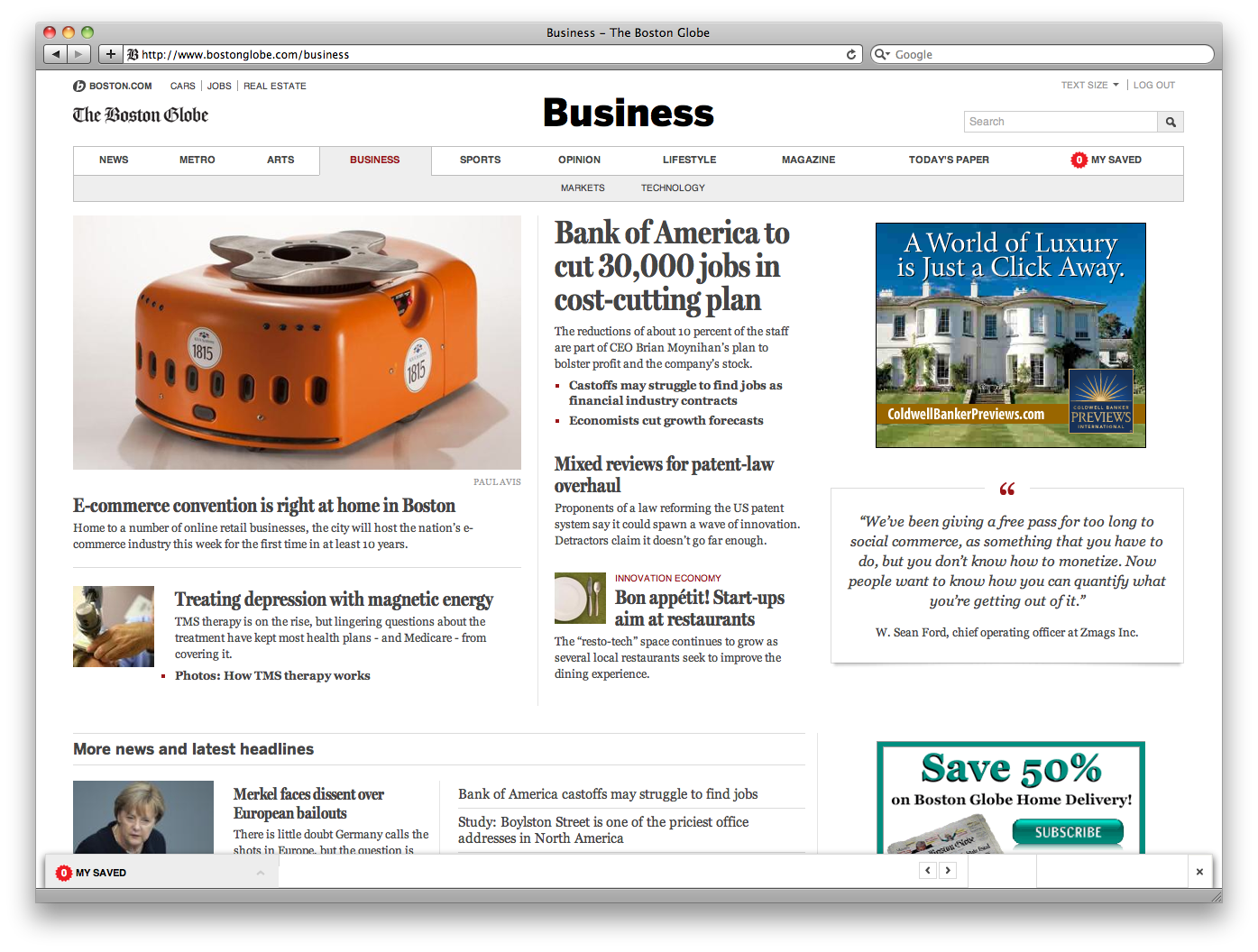
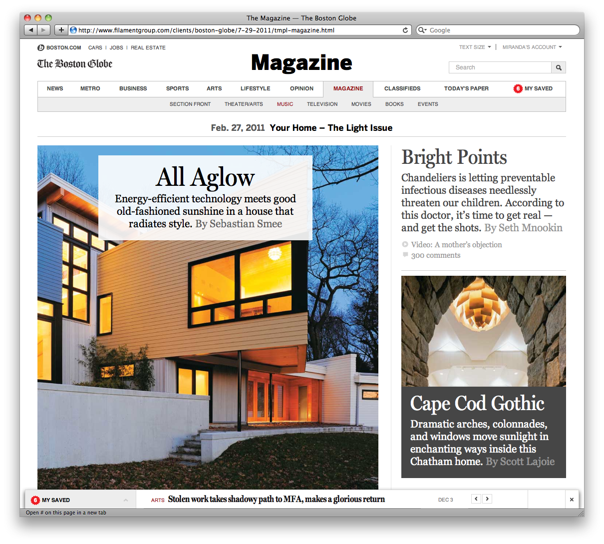
Elegant Typography, Bold Visuals
The Sunday Magazine section showcases some of the hallmarks of the new design: Big, bold photos and elegant typography. The site uses Miller, a custom-drawn typeface that's an important part of The Globe brand. The fonts come from our friends (and Fort Point neighbors) at The Font Bureau.
My Saved: Your Own Personal Reading List
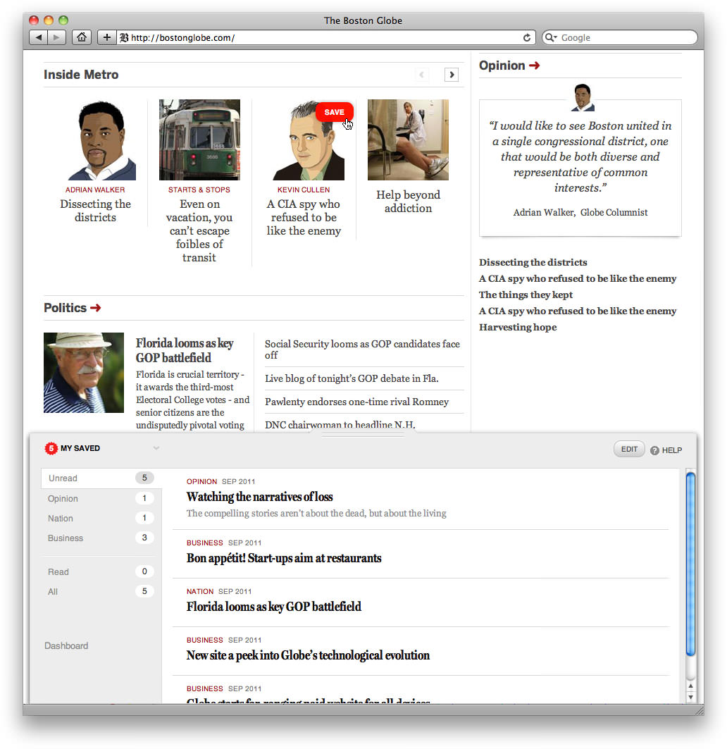
My Saved list lets you save any story on the page in a single click. Just hover over the link, click, and story shoots down to a drawer of your saved stories at the bottom the page. My Saved is available wherever you go — it's even available offline. So you can read stories on the T or when you login at work. Pretty cool.Big ups to Scott Jehl and Ethan Marcotte in particular on this feature. As Todd Parker, Miranda Mulligan, and the team brainstormed the best way for this to work, we ran into one technical obstacle after another. Those two rose to meet every challenge — pushing everyone to think bigger at the same time. Don't recall a single time when they said, "We can't do that."
On Your Phone
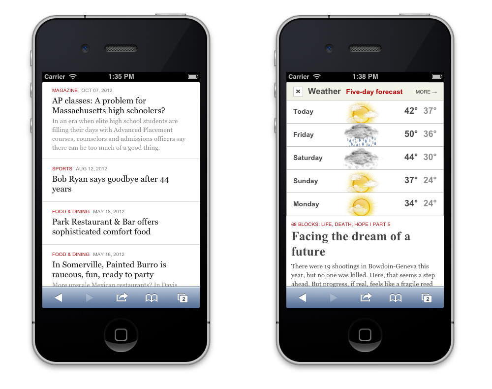
All the same features and content remain available, but the layout narrows to a simple, scrolling, single-column view.
Cinematic Photo Galleries
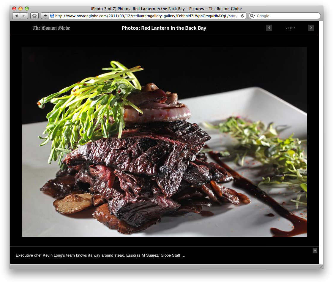
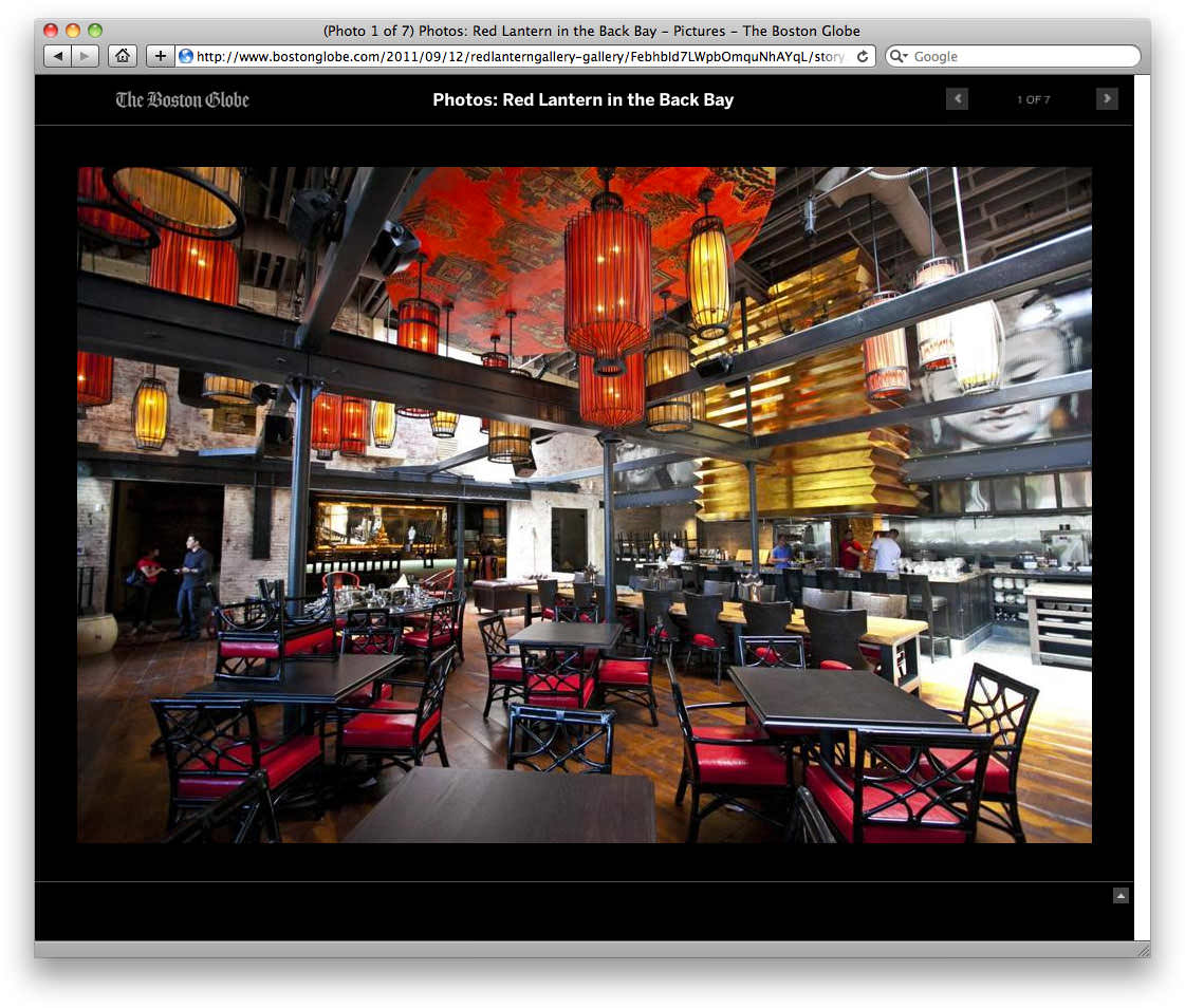
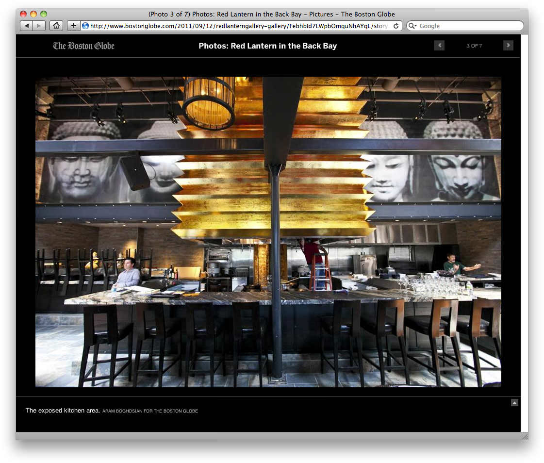
With giant photos framed on black matte, galleries are designed to be as immersive as the article pages. Everything moves out of the way to keep the focus where it should be: On the images.
