Design & Prototype
Boston.com
Remaking a Boston Icon for a New Era
The process of researching, designing and engineering New England's water cooler.
Since its launch in 1995, Boston.com has grown into one of the most highly trafficked websites of its kind. If you live in Massachusetts, it’s your first stop for the latest local news, weather & traffic alerts, or sports coverage.
News. Sports. Weather. All those topics have something in common: Immediacy. Even more than other news outlets, Boston.com is a website for right now. It’s the place everyone goes to track the latest Nor’easter and check the latest Red Sox score.
It’s more than, that, too. It’s a community. Boston.com is the water cooler that New Englanders gather around. The place everyone goes to commiserate about the snow or celebrate another World Series win.
Our Mission
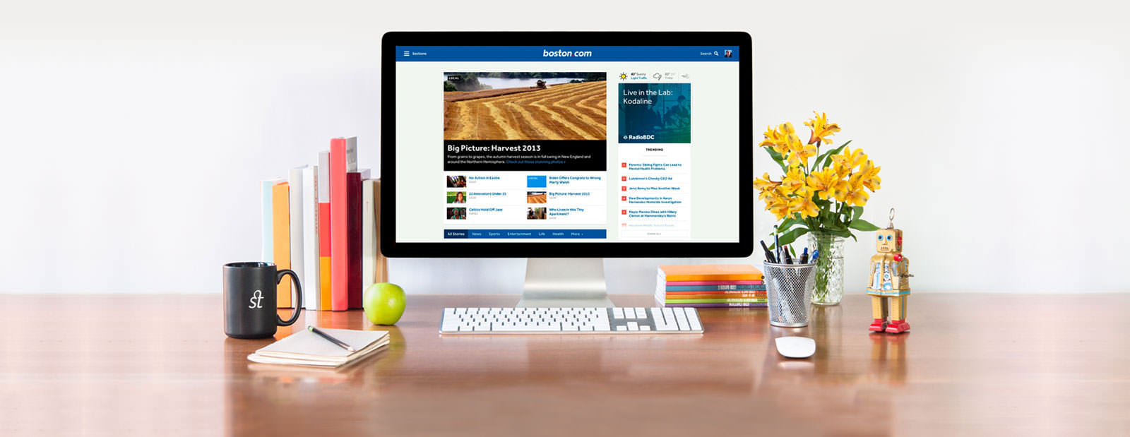
We set out to create a faster, more immediate Boston.com that reflects the community it serves. Working hand-in-hand with the team at Boston.com, we designed, built, and wrote content for a comprehensive prototype, then refined it through several rounds of user testing. The result is a new vision for Boston.com, a site that provides an up-to-the-second snapshot of the city and the people who call it home.
Snappy Stories
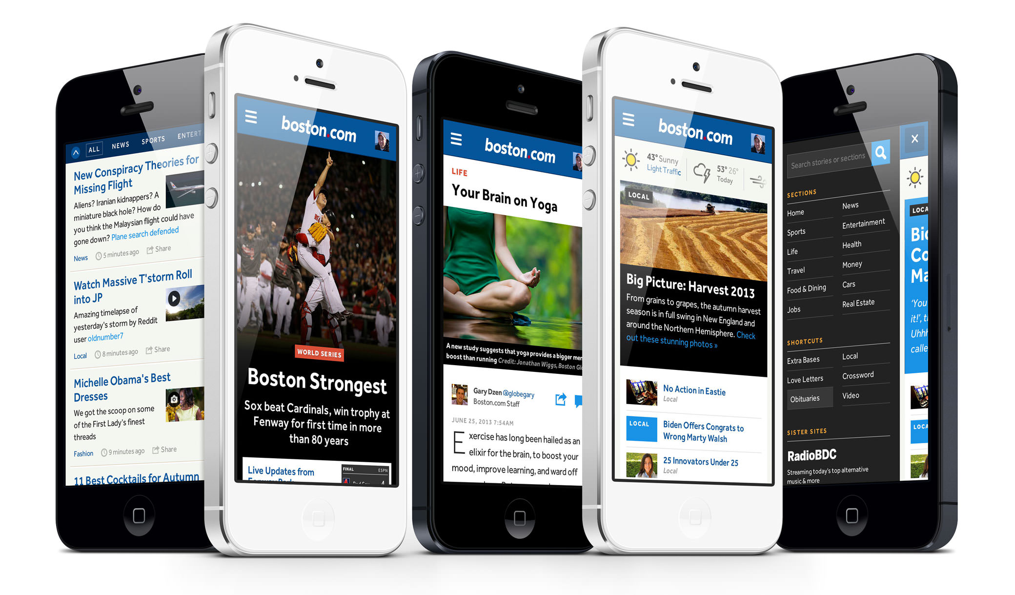
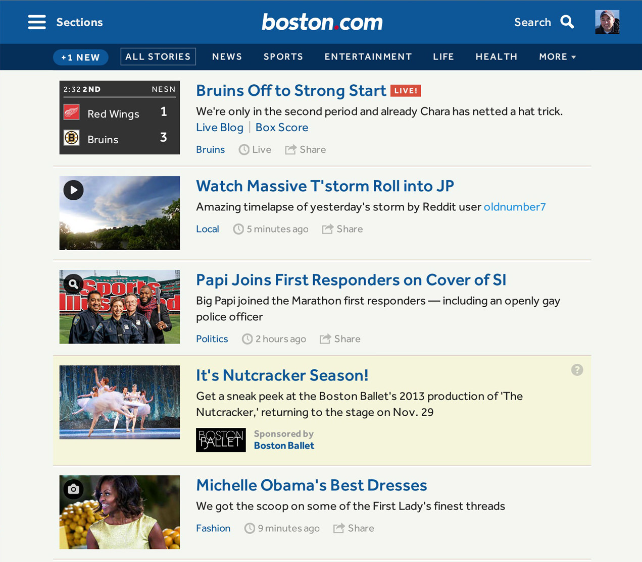
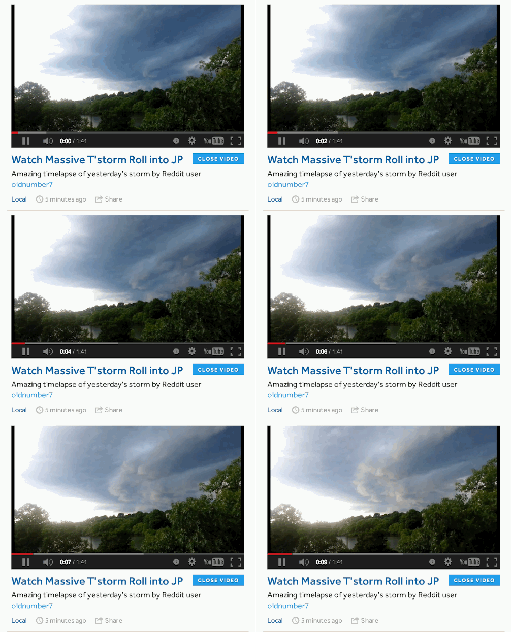
We optimized every interaction in the news stream to deliver the story as fast as possible. New stories appear as they happen. Videos play right in place. Images pop-up without a page load.
Smart Galleries
We prioritized flexibility & speed in a series of templates that look amazing whether the gallery is telling a story with text and small photos, letting gorgeous photography speak for itself, or doing both at once.
Simple Navigation
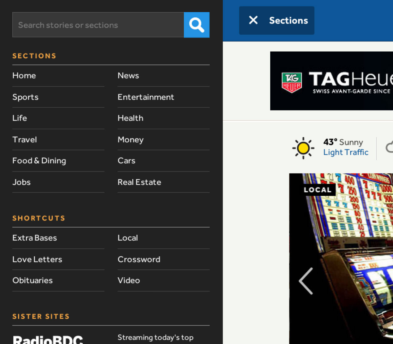
Always at your fingertips, the persistent Table of Contents links to all major sections plus the site's most popular destinations. Meanwhile, the filter nav offers instant access to top stories across a range of topics.
Research
Defining the Audience
Early in our research, we learned that over two thirds of the Boston.com audience fall into two categories:
Headliner
For Pleasure
These users visit frequently for a snapshot of the news or a fun break from their day. They don’t want a deep read. They come to the homepage for a quick hit, go away — often without clicking a thing — and come back again an hour later. The analytics told the same story:
Homepage Patterns
- High proportion of direct traffic
- Time on site is short
- Visits outnumber uniques
- Bounce rate is high
As the people who maintain and write for the site everyday, Boston.com producers know this well. When we interviewed them, a mantra emerged: “Be live, be fast.”
Content Strategy
Before it could transform itself into a more nimble site, Boston.com needed to rethink how it reported the news. We helped form a strategy around telling smaller stories and amplifying the voice of the community.
Incorporate More Sources
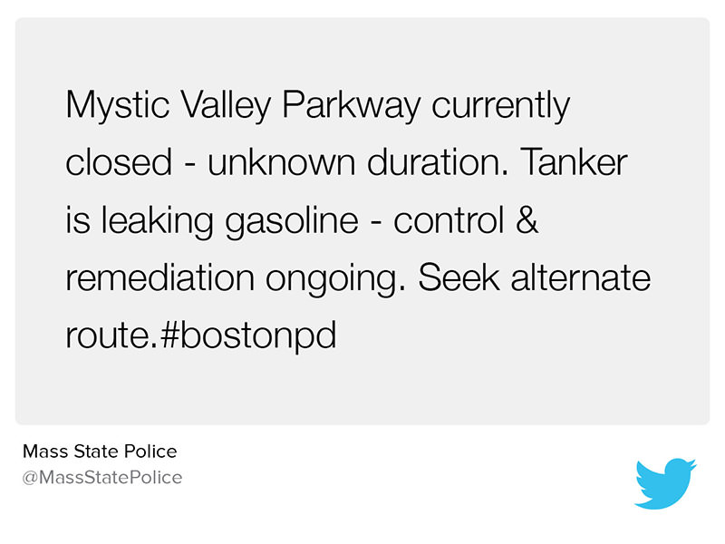
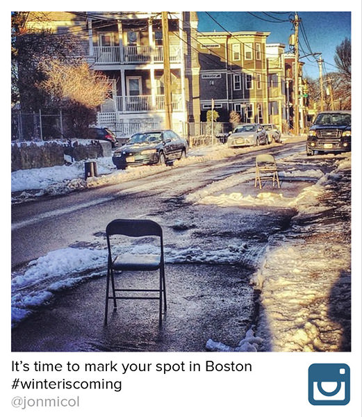
Telling faster stories meant rethinking the lifecycle of a Boston.com narrative. When a fire breaks out in Back Bay, the story often starts with something small. Someone calls the fire department. A neighbor tweets about it. An eyewitness snaps a photo.
The new Boston.com considers each of those individual elements a story in itself. The journalistic instinct is to collate all of that into a narrative. Eventually, they will (or, more likely, The Globe will). But to be fast, to be first, you need to watch the world around you and possess the tools to publish information fast.
Since many of these stories come straight from the community, it creates a virtuous loop. Regular Bostonians literally see themselves on the homepage. Their voice contributes to the larger story and to the community itself.
Curate Like Hell
While that’s great in theory, someone has to find these stories and curate them. Enter the Boston.com producers. We think that David Carr’s quote perfectly captures their role on the new site:
“Great digital journalists consume and produce content at the same time, constantly publishing what they are reading and hearing.”
David Carr
New York Times Media Critic
At key points throughout the process, we brought producers into our studio or met nearby at the Globe's office. Together, we focused on the content. Everyone talked about the best way to cover stories and communicate the site’s fun, friendly voice. We filled the prototype with real stories, tweets, and teases.
News Stream
A Snapshot of Metro Boston
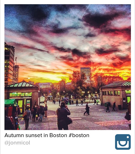
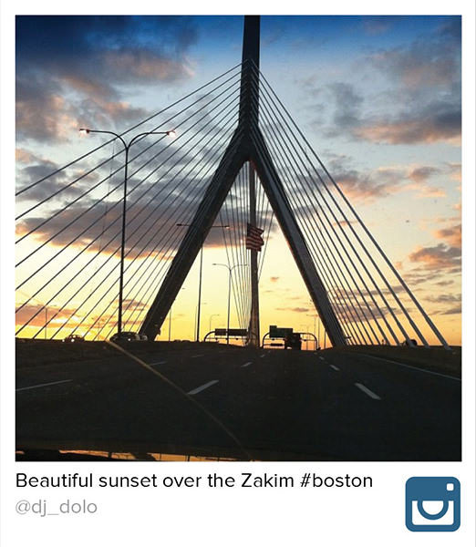
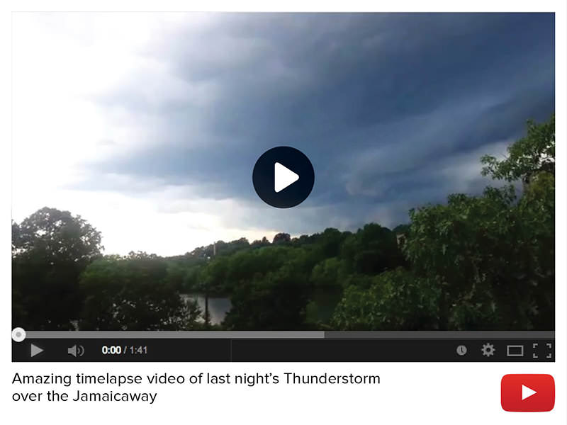
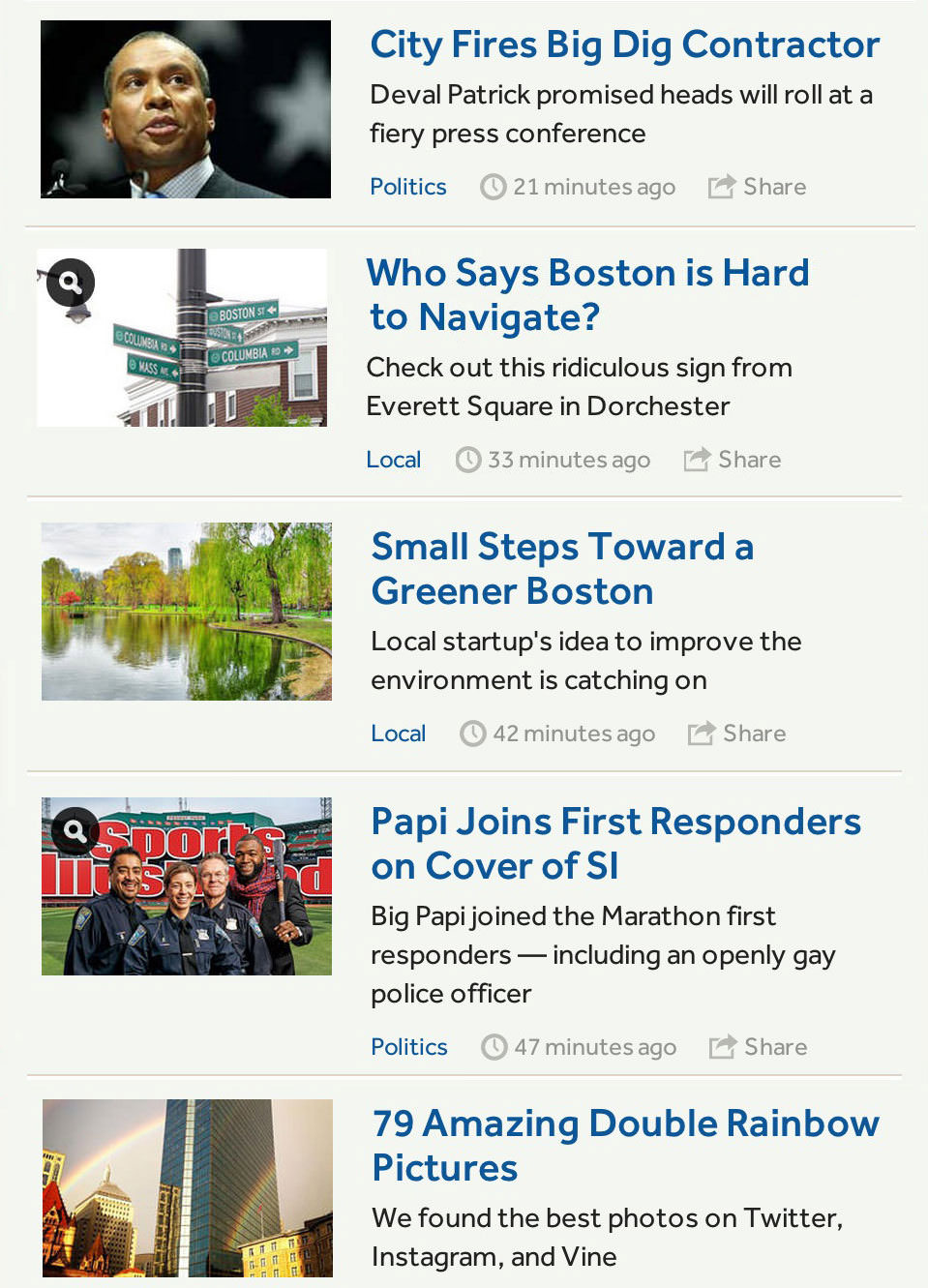
All of these ideas converge in the diverse stream, which publishes traditional Boston.com headlines alongside curated community stories. This ever-changing collection fits the profile of Boston.com’s most common user: The frequent visitor looking for a quick dose of local news or entertainment. The stream is the centerpiece of the new site, appearing on the homepage and beneath every single article.




Going Big
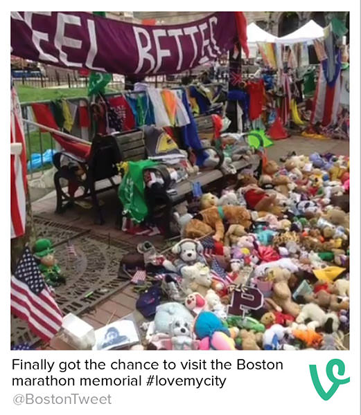
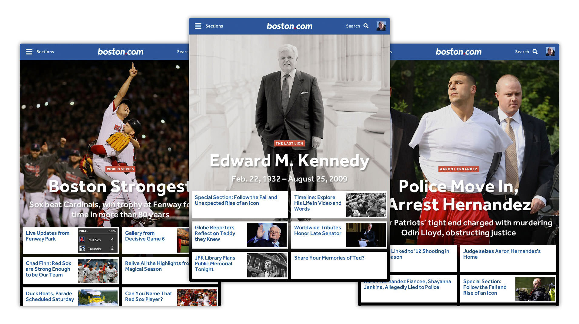
While the stream is all about capturing small moments, some events are big enough to warrant breaking the paradigm. Recently, Boston has had its share of momentous community experiences — some shocking, some tragic, some triumphant. The big news treatment echoes that emotion through bold photography and communicates the key facts through multifaceted teases.
Mobile-First Design
From the beginning of the redesign, everyone on the team took a phone-first approach. That’s why we think Boston.com is at its best when it’s in the the palm of your hand. It’s the perfect medium for quickly catching up on the city around you, whether you’re sitting at home watching the Sox game, riding the Red Line, or waiting in line at Pizzeria Regina.Explore Our Prototype
